Atlas

Atlas

Founded by Astrid Stavro and Pablo Martín, Atlas is a brand and design consultancy based in New York and Mallorca. From chocolate packaging to magazine layouts, they consistently craft work that is whimsical yet still remains clean and elegant.

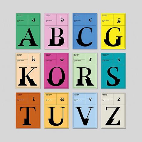
One of their more quirky projects is FS Sally Triestina, a typeface they designed in partnership with It’s Nice That and Fontsmith. The typeface was inspired by Stavro’s hometown of Trieste, Italy and the city’s contrasting architectural styles, cultures, and mindsets. The unique letterforms are beautifully displayed on specimen sheet posters that represent neighborhoods within the city.

Read the rest of this entry »

Stay Nice

Stay Nice

Stay Nice is the studio of Rob and Barry van Dijck. The duo crafts dynamic designs for performances and exhibitions throughout the Netherlands. I am especially drawn to their work for Playgrounds, an annual showcase that celebrates contemporary animation, game development, sound and graphic design. The festival’s identity system features lively typography that expresses the exciting and whimsical nature of the event. Flysheets promoting recent guest speakers contain fragmented type that elegantly blends in with the presenter’s artwork. The end results are promotional materials that have proven to be just as striking as the pieces displayed at the exhibition.

Read the rest of this entry »

Design by Toko

Design by Toko

Design by Toko is a multi-disciplinary studio based in Sydney. With a focus in branding and spatial design, they crafted a whimsical wayfinding system for the East Sydney Early Learning and Community Centre. The identity features vibrant colors and a rounded/welcoming typeface incorporated into signs that resemble children’s building blocks. In addition, the wooden frames and geometric compositions complement the building’s architecture and the playful nature of the space.

Toko also has a love for avant-garde design. This passion is manifested through side projects, including Gallery by Toko. Here, they aim to showcase artists and art movements that are rarely exhibited in Australia.

Read the rest of this entry »

Mira Design

Mira Design

Miranda Mayne launched Mira Design in 2015 with the intention to work with small businesses and socially conscious enterprises. Recent projects include One Tenth – a clothing company that supports survivors of human trafficking in Kolkata. For this collaboration, she crafted simple geometric illustrations to be implemented on t-shirts. Mimicking the movement of water and tides, the graphics represent the changes One Tenth hopes to evoke in the lives of others. Her love for minimalism is also present in her fine art. Reducing objects down to their most basic forms, she paints clean, yet striking compositions on handmade cotton papers.

Read the rest of this entry »

Magdiel Lopez

Magdiel Lopez

I love personal design projects, so I was thrilled to discover Magdiel Lopez’s daily poster series. Since October 2016, he’s designed a poster every single day. This daily exercise allows him to explore new skills and techniques including painting and pixel sorting. The themes and styles featured in his work transition throughout the year as he often references pop culture and recent events. To see the entire collection as well as time-lapse videos of his technical process, visit his Instagram.

Read the rest of this entry »

David Rudnick

David Rudnick

David Rudnick’s passion for music and art history fuels his work as the artistic director of Making Time, a club night focused on transcendental and futuristic sounds. For the event posters, he layers a mélange of elements to create compositions that are just as fluid and vibrant as the music itself. Pulling from a wide variety of materials, his inspirations range from 90’s fashion photography to religious Renaissance paintings. The visuals are then integrated with custom typefaces (often designed himself) to form cohesive pieces that are dynamic and original.

Read the rest of this entry »

Shawna X

Shawna X

With bright neon colors and lush gradients, Shawna X crafts illustrations that illuminate today’s hottest political issues. In her recent exhibition, Alone Together, she focused on matters that have heightened post-election, such as discrimination, climate change, and sexism. The title of the series is shown most clearly in the mural above. Here she conveys a growing disconnect amongst the American public. Shawna explains, “We allow ourselves to stay within our comfort zones—our pools—but we don’t reach out to the other side for more open dialogue and understanding. We’re either thriving or dying. We’re both awake and ignorant. We’re isolated yet we’re next to one another.”

Read the rest of this entry »

Triangle Studio

Triangle

Triangle Studio strives to design with “rational strategy and emotional harmony” in mind. This mentality helps them create clean and balanced compositions that shine with vivid colors and playful patterns. Based in Seoul, they craft packaging, branding, and editorial work for an array of clients. In addition to their professional projects, the studio releases a quarterly publication called Try Angle Papers. Here they experiment with different techniques, including marbling and papermaking, to create unique notebooks, posters, and postcards.

Read the rest of this entry »

Marylou Faure

Marylou Faure

Specializing in character design, Marylou Faure creates colorful worlds filled with fearless fashionistas, tattooed hipsters, and adorable animals. These quirky and emotive characters have led to collaborations with Google and Glow to create stickers for their messaging apps. The success of the stickers inspired her to launch a set of her own titled, The Feels. Here she proves her whimsical approach to illustration is a perfect match for the medium. Her hungry hamburgers and flirtatious pairs of underwear would make anyone respond with an enthusiastic, “LOL”.

Read the rest of this entry »

Glasfurd & Walker

Glasfurd & Walker

Glasfurd & Walker crafts memorable brands that burst with personality. Based in Vancouver, they collaborate with an array of Canadian businesses including salons, retail shops, and dining establishments. I am especially impressed with their identity system for Park, a restaurant and distillery inspired by its unique location in the Banff national forest. As an ode to its surroundings, the system features bold typography and retro color schemes reminiscent of WPA posters of the past. This is further reinforced in the packaging for a line of liquors that features illustrations of the area’s beautiful mountain ranges. For visiting campers, the studio designed a plethora of souvenirs including, mugs, pocketknives, merit badges, and matchboxes. These elements come together to create a whimsical brand that celebrates the town’s rustic lifestyle.

Read the rest of this entry »