Sweet CAPAC logo nectar

CAPAC lp cover art design and logo

The Asian American Film Festival is in San Francisco now, so I had a chance to check out “Blood Brothers” which is one of the more recent films produced by John Woo. Anyone else seen this? Overall I thought it was pretty cheesy, but the ending wasn’t too bad. On the way to the theater I stopped by my friend Cool Chris’s record shop. Chris runs Groove Merchant which is notorious amongst beat diggers and record collectors as the place to go if you want to find rare jazz, funk and library lps. While I was there Chris hit me off with a copy of the record above.

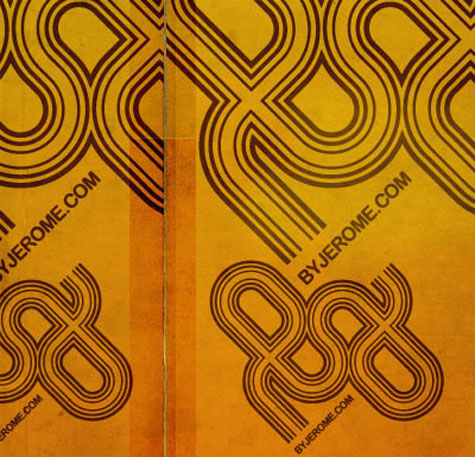
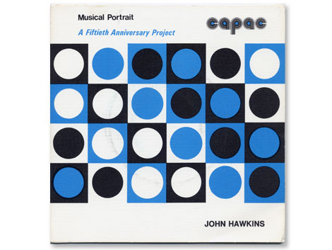
The John Hawkins lp seen above is part of a series of 45s (the little records..7″) initiated by CAPAC (Composers, Authors and Publishers Association of Canada Limited). I’m less concerned with the music on this album as I am with the design of the logo. The rounded letters take form as records with the lines of different weights creating the grooves. It wasn’t uncommon to see logo treatments like this in the 1970s and I think this is one of the better examples.

Hello Freaks!

Hello Freaks!

Hello Freaks are based in Paris, and led by one Jerome Castro (who has a cool blog, in French.) Their illustration work is really impressive, and includes lots of mouth-watering type. Be sure to check the motion work as well. It’s a nice departure from the standard motion reels we’re used to seeing all over.

Thanks to Sharon for the heads up on Hello Freaks.

Jacques Nathan Garamond poster update

Jacques Nathan Garamond Telefunken poster
original version

Jacques Nathan Garamond Telefunken poster
upadated version by Daniel Knef

Several weeks ago I posted a Jacques Nathan Garamond Telefunken poster. One of my comments was the poster would look better if Jacques killed the telefunken logo located to the right of the reel to reel. Grain Edit reader Daniel Knef was nice enough to send us a modified version of the poster minus the logo (see above). I realize this poster would not of been possible without the client and obviously their branding is going to be part of the design. However, its nice to see the design without any distractions.

Many thanks to Daniel for sending us the updated version. Be sure to check out his electronic music compositions at gran où lée.

Edizioni Corraini – Un Sedicesimo magazine

Italo Lupi - Un Sedicesimo magazine - Edizioni Corraini
Un Sedicesimo issue #2 – Italo Lupi

Last week we looked at the first part of a package I received from Italian publisher Edizioni Corraini, which included a copy of the Pino Tovaglia book. Today we’ll look at the second part of the package.

Read the rest of this entry »

Colorcubic – Nueva Forma logo design

Colorcubic - Nueva Forma logo

I’m digging Colorcubic’s identity work for Nueva Forma. You can check the rest of their portfolio here

Swiss Air ephemera – design by Kurt Wirth

Swiss Air leaflet - design by Kurt Wirth

Swiss Air leaflet - design by Kurt Wirth
Swiss Air pamphlet – designer: Kurt wirth and Paul Beer c1950s

SwissAir has a rich history with some of Switzerland’s finest designers. Over the last 60 years the Airline has worked with Karl Gerstner, Kurt Wirth, Donald Brun, Fritz Buhler and Siegfried Odermatt just to name a few. The pamphlet above is one of many brilliant pieces to result from this relationship.

It appears to be some sort of promotional piece for the Douglas DC 7 which was produced in 1956. I love how Kurt Wirth laid out the information.

You can see the rest of the pamphlet at Ace Jet 170. Many thanks to Richard for posting this gem.

Be sure to check out our other posts related to SwissAir design.

Typographes d’Estienne – French Type Specimen book

[pictobrowser 10159078@N03 72157604082497636]

Typographes d’Estienne 1950

It’s been a while since I’ve posted any type-related goodness, so I figured it was time to post the slab of paper above. The book includes 40 – 50 pages of modern San Serif specimens worked into menus, advertisements and letterheads. In addition, there are several tipped in brochures and posters you can flip through. Given the title, I would assume this is an annual and that there are other years available.

Pino Tovaglia book – Exhibition of design work

[pictobrowser 10159078@N03 72157604060512778]

Pino Tovaglia book – The rule that corrects emotion

In addition to this blog, I own a small design bookstore. As a bookseller, I find it hard to find publishers that consistently produce quality titles. Italian publisher Edizioni Corraini is one of a few publishers that I look forward to their new releases each year. If you own or have seen any Bruno Munari books, you are most likely familiar with their work. They have reproduced dozens of Munari’s books, many of which I own in my personal collection. In addition to the Munari collection, they have produced books on or by Martí Guixé, Enzo Mari, Aoi Huber-Kono (Max Huber’s wife),Taro Miura, Albe Steiner and many others. With this in mind, I was delighted when I received an email from them mentioning that they had been reading Grain Edit and that they would like to send a package my way.

I will cover the contents of the package in several posts. The first being the Pino Tavaglia book seen above.

Read the rest of this entry »

Garrett Morin illustration and graphic design

Garrett Morin-illustration-and-graphic-design
Cover illustration/typography for the Yale University Art Gallery spring catalog

Garrett Morin does great work. He draws lots of type and makes people happy. You may have seen his works in the likes of Mike Perry’s Hand Job book. If you click on over to his site, you’ll find lots of happy characters, t-shirt graphics, corn-cob pipes, animated GIFs, skateboard graphics, magazine covers, and a great animated spot for Death Cab for Cutie / MTV.

Garrett’s also a member of the Rad Mountain collective, which recently did some yummy illustrations for Good Magazine. Check it.