William Golden and the history of the CBS logo

william golden cbs logo

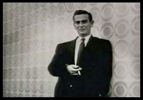
CBS logo designer William Golden

The CBS logo has shaker roots! Who knew? In this video, fellow CBS designers Lou Dorfsman and Kurt Weiss explain how creative director William Golden was inspired by an article on Shaker art that ran in Alexey Brodovitch’s Portfolio Magazine.

(via Lined & Unlined)

Montreal EXPO 67 memorabilia – Soviet guide book

[pictobrowser 10159078@N03 72157605411048523]

Ephemera from the Soviet Pavilion at Expo 1967 (World’s Fair)

I found this guide book a few weeks ago hidden in a box of old paper goods. I almost dropped a loaf when I saw the maps contained within. The maps display the table arrangements and walking paths for each floor of the Soviet Pavilion which was designed by Russian architects M. Posokhin, A. Mndoyants and B. Tkhor. Simple and effective layout of the information. I love Circular blobs, lines and arrows and these maps are chock full of that good stuff.

The Soviet Pavilion was filled with cool exhibits including; Russian postage stamps, Matryoshka dolls and folk art, space exploration as well as a restaurant that featured bliny and Ukrainian borsch.  I wish I could of gone, but I wasn’t even born yet.

Grotesque poster

akzidenz grotesk swiss poster

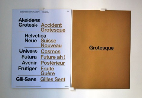
peter & wendy just released this classy piece of posterage entitled “Grotesque”. It’s a double-sided 170 gr/m² Offset paper poster printed in black and PMS 871U. Get your hands on it while you can. It’s a limited edition run of 100.

Chicago 3 – Society of Typographic arts design annual

chicago design annual

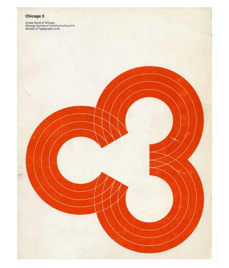
Cool cover for the 1969 Chicago 3 design annual. Consists of three “C’s” or if you look from left to right, the letter “C” and the #” 3″. The annual is a catalog of work from the Artists Guild of Chicago, Chicago Society of Communicating Arts and the Society of Typographic Arts.

Evening Tweed

Evening Tweed

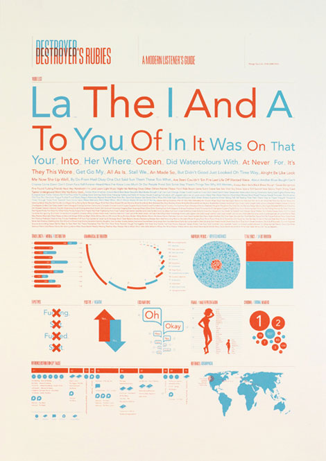
Evening Tweed is a Brighton based design collective, formed by four students at the University of Brighton. If the above image is any indication, all the work from these four is great. As a whole, the work is nicely varied and shows strong directions from each member. Lots of personality and experimentation going on.

Check out their class site. More talent there as well.

Sichuan Quake relief

Sichuan Quake Relief China

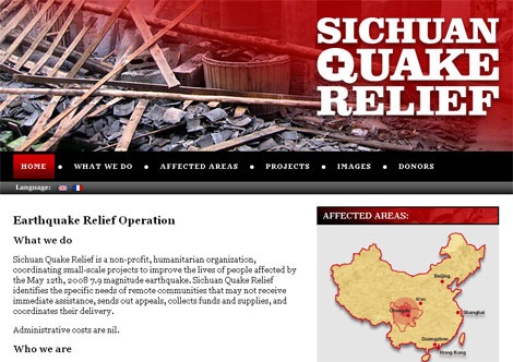
Simon Perrin who recently won the Herbert Bayer Olivetti poster contest, just notified me of a website he put together which offers news, info, links to the relief efforts/projects and some of the fundraising initiatives for the recent earthquake in China’s Sichuan province. Simon was living in Chengdu, the capital of Sichuan province, when the earthquake hit.

You can find more info about the relief efforts here.

Steven Harrington touring art show

steven harington art show

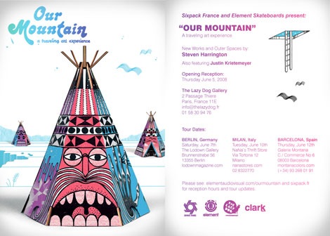
For those of you in Europe Steven Harrington has an artshow touring through Paris, Milan, Berlin and Barcelona. In conjuction with the tour Steven is releasing his first solo book.

In addition to the book, He is also releasing some custom shaped and designed limited edition element series decks, a paper toy and 10 new prints. You can check the tour dates, SH book info, day by day photo blog of the tour and in progress shots here at the Our Mountain website.

Tour kicks off June 5th in Paris.

Modern Czech matchbox label

1960s czech matchbox label

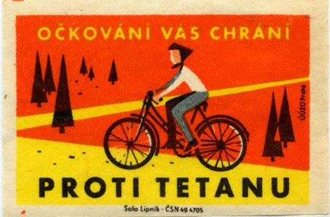
Solo Lipnik – UUZO Praha – Pronti Tetanu label – 1960s?

Super cool matchbox label from Czechoslovakia. Pretty intense colors. Nothing like taking a bike ride through a field of ketchup. Can anyone translate the text?

The Little Friends of Printmaking!

The Little Friends of Printmaking

Tears of joy! It’s The Little Friends of Printmaking, Wisconsin’s #1 husband/wife design team super duo. LFoP are a Milwaukee based design studio whose work is really exciting and inventive. Each piece has a great story/narrative (and typography) that pulls you in. You can really tell that there is a lot of experimentation going on over there. I would love to see them get into motion graphics, a lot of this work is aching to be animated.

Their website is great too; it’s as engaging as the work. Lot’s of little things to look at and click at.

They also have a store and a blog.

TypeCon 2008 poster gallery – Call for entries

TypeCon-poster

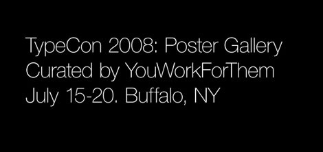
If you don’t know what TypeCon is, it’s the leading conference in America on Typography. YouWorkForThem is curating a poster exhibit at TypeCon. They are looking for your best poster work that has excellent usage of Type on it. It can be the main focus, or minor. They will be displaying the best submissions and the poster show will most likely travel, like the last one did. Don’t wait till last minute, send your entries over now! Please help spread the word, they want as many submissions as possible.

Click here for more info and to download the submission PDF.