Forest Small Book Series

forest small book series

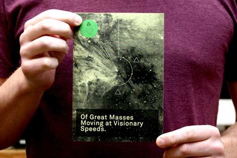
Of Great Masses Moving at Visionary Speeds – Small Book Series vol. 2

I’ve been meaning to post this for a while. Joel over at the design studio Forest (of The Drama magazine fame) sent us this swell little book that’s part of the Forest Small Book Series. Books in the series are released quarterly and feature various thoughts, sketches, collections, and travels. Each issue is handmade using French paper and designed by Forest.

Vol. 2 (seen above) features photos by Joel and quotes from CS Lewis’s Out of the Silent Planet. I really like the quotes Joel selected for inclusion in the book. Here’s one:

“To EVERY MAN, in his acquaintance with a new art, there comes a moment when that which before was meaningless first lifts, as it were, one corner of the curtain that hides its mystery, and reveals, in a burst of delight which later and fuller understanding can hardly ever equal, one glimpse of the indefinite possibilities within.”

Each issue is only $5, so stop by the Forest website and pickup vol. 2 and the recently released vol.3. You can sign up for a yearly subscription as well.

Charles Goslin – graphic designer and illustrator

charles goslin graphic design

Bedside Nurse magazine design from 1968, 1969 and 1970

Charles Goslin (1932-2007) began his career at Lester Beall’s studio in 1954 and left to pursue work at corporate identity firm Lippincott & Margulies in 1958. Three years later he parted ways again, but this time to begin what would be a lengthy career as a freelance designer and illustrator. During this time he started teaching at Pratt Institute as well, where he became known for unique assignments.

For those interested in learning more about Charles Goslin, former student Scott Santoro has written a lovely piece about him here.

Also of interest:

Graphic designer Clarence Lee – He worked at Lester Beall’s studio in 1958, possibly at the same time as Charles Goslin.

Petit Collage animal alphabet poster

petit collage aninal alphabet poster

Animal Alphabet 18 x 24 poster. 3 color screen print

I first ran into San Francisco based Lorena Siminovich’s work at a local store that carries modern goods a few years ago. It was the Elephant collage seen on this page that caught my eye. Since then she has released a small zoo of colorful collages, posters and notecards.

The poster seen above is the latest addition to her collection. Check out that chocolate elephant! He’s hanging out with his mysterious friend that starts with a letter “i” and drinking some yummy camel leg. Lots of Fun!

You can see this poster and the rest of the collection at Lorena’s website: Petit Collage.

Airline memorabilia – vintage playing cards

british airways playing cards

British Airways standard playing cards – 1970

Woah, British airways on acid! Anyone know who designed this deck of cards?

Philippe Apeloig

Philippe Apeloig

Philippe Apeloig runs his own studio, Apeloig, in Paris, France. Not only does Philippe have a lot of work his site, but it’s very well documented and photographed. You can get a sense of the amount of experimentation and playing that goes on in his work.

Modern book cover art – Creative America

creative america-cover

Creative America: Art director- Albert Squillace c1962

Thanks to Chad for sending this in. Looks very similar to the book cover design work of Paul Rand.

Also worth checking:
Modern Dutch book cover design
1960s Penguin books

Editor of Dwell Magazine reveals his modern home + his owls

sam grawe editor of dwell house

sam grawe editor of dwell house

Apartment Therapy posted photos of Sam Grawe’s apartment yesterday as part of their 2008 home tour series. Sam is the Editor-in-Chief at the San Francisco based Dwell Magazine. If you are unfamiliar with Dwell, it is a magazine that focuses on modern architecture and design.

Sam has lots of goodies in his house. The place is filled with Danish modern furniture, Bertoia chairs and Scandinavian nic nacs. What did me in was the record covers and the owls. This is a man that loves owls! He has a slew of these Edvard Lindahl looking ceramic miniature birds of prey. Too be fair, it looks he holds no Owl biases. I see examples of Strigidae (Heck yea, I’m name dropping) as well as the barn yard variety. I actually know nothing about Owls. I picked all this up in a two minute search at Wikipedia. Anyways, I’m getting off track. To sum up, just check out the house tour.

Elizabeth Shoes – Vintage shoebox – 1970s ?

vintage elizabeth shoes box

Elizabeth shoes shoebox possibly from the 1970s

I just about flipped when I found this image of an Elizabeth shoe box on flickr. I love the organic lines flowing inside the butterfly wings. Is it me or does it look like the body of the butterfly is rising from a lighter thats created when the letter “L” and letter”i” are placed next to each other? I doubt that was their intention, but its still looks cool. I can’t get enough of those branches that stem from the letters. Has anyone heard of this company? Is this a new company or is this from the 1960s or 1970s?

Many, Many thanks to Fountaineer for posting this.

Aldo Novarese – Recta Sans Serif Typeface for Nebiolo

Aldo Novarese recta san serif typeface

Aldo Novarese – Recta Type Specimen sheet circa late 1950s/ early 1960s.

Beautiful san serif typeface by Aldo Novarese. He designed Recta in 1958 while serving as the art director at the Nebiolo type foundry (Societe Nebiolo Torino) in Turin, Italy. Novarese is well known for designing the modern typeface Microgramma, which later became Eurostile.

In the pictures below, you can see a few examples of the 21 fonts that were included in the Recta font family.

Read the rest of this entry »

Poster Offensive 4 – Minnesota poster art show

poster offensive 4

For those of you in the Minneapolis/ St. Paul area, Poster Offensive 4 will be hitting your hood on Friday August 29th 2008 at the Black Dog Cafe.  The show later travels to the Frank Stone Gallery on October 3rd.

Poster Offensive is partnering up with the organization, Provention: A group of Minnesota artists offering a peaceful welcome to the GOP conventioneers as they arrive in town. The Poster Offensive is a non-partsian poster show dedicated to the promotion of peace and democracy.

Participants include: Aesthetic Apparatus, Peet Fetsch, Todd Bartz, Boyd Brent , Kelly Munson and many others.

For gallery times, dates and locations click here.

Many thanks to the gracious people at Spunk Design Machine for putting this event together and for sending us some of the swell posters seen above. If you live in the Oakland area and would like a poster, please contact me.