The Architecture of Gomorrah – La Vele di Scampia

la vele di scampia

I recently saw Gomorrah, which took the Grand Jury Prize at Cannes, and was definitely intrigued and curious as to the origins of the beastly, monolithic sail-like housing complexes where the movie was shot. La Vele di Scampia, or the Sails of Scampia was an offshoot of the post-war modernist social housing explosion gripping the world, including Naples, Italy where it was located. Each complex, shaped like a sail, consists of apartment units with stairs leading to central walkways on each floor. The result is a spectacularly open public space in which people can see and be seen.

Read the rest of this entry »

Jeffrey Bowman: Illustration & Design

Jeffrey Bowman

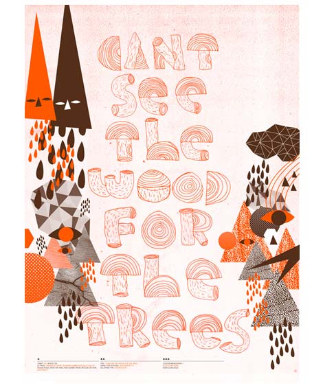
Can’t see the wood for the trees – Poster for shop opening.

Today we would like to introduce you to UK based illustrator/designer, Jeffrey Bowman whose work has been influenced by everything from space exploration and the wonders of the universe to the intricacies of type face creation and pattern repetition.

Read the rest of this entry »

Ladislav Sutnar: Catalog Design Progress

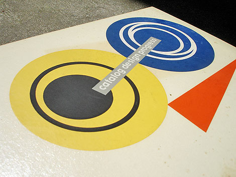
catalog design progress

Catalog Design Progress: Advancing Standards in Visual Communication by K. Lonberg-Holm and Ladislav Sutnar – published by Sweet’s Catalog Service ©1950

Really excited to present today’s book. It’s a classic by the highly underrated designer Ladislav Sutnar.

Ladislav Sutnar was born in Pilsen, Czechoslovakia on november 9, 1897. He was educated in Prague. In 1939 he traveled to New York as an exhibition designer for the Czech Pavilion at the World’s Fair. Due to the war he ended up staying in New York and was later hired by Sweet’s Catalog Service. It was here along with Sweet’s research director K Lonberg Holm that Sutnar would produce a body of work that would help to lay the foundation of information design as we know it today. One of the books to spawn from that partnership was Catalog Design Progress. The book chronicles the pair’s thoughts and experimentations with the layout and organization of information.

Read the rest of this entry »

Graphic Design Twibe for People on Twitter

Wayne Pate

A twibe is a group of Twitter users interested in a common topic who would like to be able to communicate with each other.  On each twibe’s page, there is a list of twibe members.  There is also a tweet stream that lists tweets from twibe members which contain key word tag.

We created a twibes for grain edit, mid century modern and graphic design.

Join the graphic design twibe here.

Join the mid century modern twibe here.

Join the grain edit twibe here.

—————–

Catch us on Twitter @grainedit

Grain’s Eye View: A Glimpse into Wayne Pate’s Studio

Wayne Pate

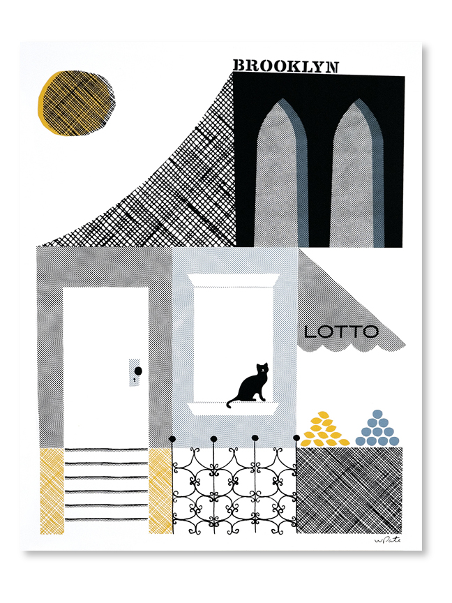
Wayne Pate runs a whimsical design studio in Brooklyn, NY called GoodShapeDesign. He has the best doodles, and also sells playful prints on his website. Today, we have the pleasure of getting the Grain’s Eye View on Wayne’s studio, including info on his favorite objects and some handy organizing advice.

Read the rest of this entry »

(Another) Update to Designers on Twitter!

Grain Edit / Designers on Twitter

Holy twit! It doesn’t stop! Designers seem to be jumping on Twitter left and right. It’s turning out to be an awesome community of designers. If you haven’t made the Twitter jump yet, then here’s a little more incentive. And if you’re already up on Twitter, here are some new faces.

Some of the new people on the list include House Industries, Kate Bingaman-Burt, Ministry of Type, Monocle, Chris Glass, Jason Munn, and Kid Robot among others.

Check it out. Follow your favorites. Tweet it up!

50+ Designers on Twitter: Our favorites to follow.

Advice to Sink in Slowly

Advice to Sink in Slowly

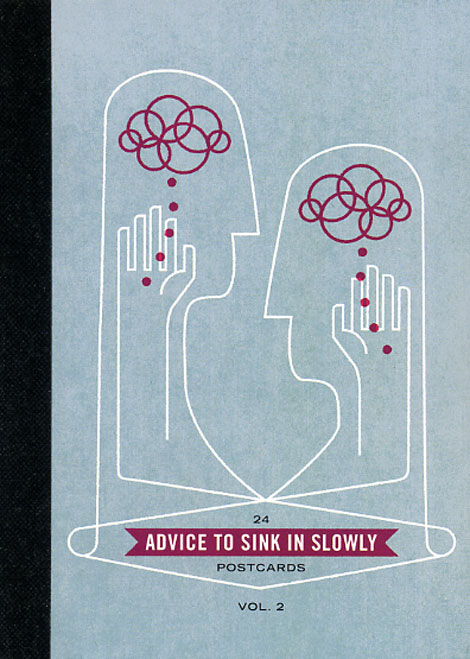
Advice to Sink in Slowly is a great idea. It’s an ongoing series of posters designed by recent graduates aimed at helping and inspiring first year students. All incoming students at participating Universities receive one of the posters.

Read the rest of this entry »

Till Wiedeck: Graphic Design

Till Wiedeck

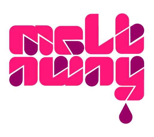
German based designer, Till Wiedeck, really melts my heart with his fabulous collection of type. This particular typeface, titled “HM Melt,” was inspired by a simple letter “a” found in a mid-’70s edition of The World of Logotypes by Al Cooper. It’s terrifically impressive that he was able to create such a fresh typeface solely based around the shape of one letter. I really love his experimentation with geometry and the positioning of various drops, simulating that the type is really melting!

Read the rest of this entry »

Richard Perez / Skinny Ships

richard perez


I’m really impressed by this work from Richard Perez. His typographic and illustration work is super fancy. He seems to have no problem navigating styles as well as tackling a variety of design projects — his work ranges from hand drawn type and illustration, to identity and traditional design. All of his work is direct, and compelling with great execution and color palettes.

It’s really refreshing to see the enthusiasm and personality in all of Richard’s work. It’s also nice to see that we share a few things in common, including VHS tapes, Lincoln, and kittens.

Read the rest of this entry »

Sneak Peek at Rilla Alexander’s Studio

rilla alexander

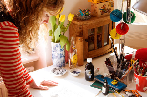
Rilla Alexander is a member of the well known and respected art and design collective, Rinzen. The group’s posters and album covers have been exhibited at the Louvre and their large scale artwork installed in Tokyo’s Zero Gate and Copenhagen’s Hotel Fox. Today she gives Grain Edit readers a sneak peek into her studio and shares some of her favorite objects.

Read the rest of this entry »