Conor Oberst Concert Poster

conor oberst poster

Conor Oberst Concert Poster by Vahalla Studios. Handmade three color silkscreen measures 18″x 24″.

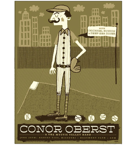
The poster pick series presses on with a piece by Tad Carpenter of Vahalla Studios. I like the limited color palette used in this poster and think that it compliments the scene perfectly. It is quiet yet delightful. The use of pattern throughout the poster is as terrific as the type choices. Plus, I’m a sucker for buildings in a background.

You can purchase the Conor Oberst poster at www.postercabaret.com

Read the rest of this entry »

Guest post at Vintage Kids’ Books My Kid Loves

le vaillant petit tailleur

Le Vaillant Petit Tailleur – Illustrations by E. Probest c1963

I’d like to thank Burgin over at Vintage Kids’ Books My Kid Loves for inviting me to guest post on her wonderful blog. If you haven’t been to her site before your in for a real treat. She often features kid’s books from the 1950’s-1970’s and from some of my favorite illustrators including Abner Graboff and Ed Emberley. For my post, I decided to share a french book entitled Le Vaillant Petit Tailleur. You can see all the mages here.

Read the rest of this entry »

The Whimsical Works of David Weidman

hong kong festivals stamps

The Whimsical Works of David Weidman – Published by Gingko Press.

David Weidman’s name may not be familiar, but his work certainly is. Weidman began his career as an animator in 1950s Los Angeles, painting backgrounds for Hannah Barbara and setting the standard for the look of cartoons of that era. However, like a true entrepreneur he soon began to work for himself, and went on to establish a style that is today instantly recognizable and iconic. A printmaker, ceramicist, font designer, painter, cartoonist, and silk screener, Weidman never stopped experimenting as an artist. Today at age 87 Weidman’s staggering body of work is just as modern and visually stunning as it was forty years ago. His graphic sensibility and expert use of saturated color palettes evoke the vintage modern look while remaining completely relevant to contemporary designers.

If you don’t have a copy of this book yet, it’s seriously worth picking up. You can can pick up a copy here.

Read the rest of this entry »

Mig Reyes – Blog Wars Poster

hong kong festivals stamps

People are dying for blogs y’all

Blog Wars? What the heck is going on in Chicago? People killing each other over raw RSS product? Naw, turns out Blog Wars is a gathering of Chicago’s top dance music DJs—who all happen to run successful blogs.

The poster was created by talented designer and all around rad guy Mig Reyes. I love how Mig breaks up the rigid grid with streams of folkadelic type which parallel the flow and feel of vinyl records. It slightly reminds me of Lance Wyman’s identity work for the 1968 Mexico Olympics which played off traditional Huichol Indian art. I hope Mr. Reyes printed up extra copies of this poster, because I know some people will want to get their hands on this war-torn gem!

Read the rest of this entry »

A. Micah Smith / My Associate Cornelius

Upon viewing the work of Micah Smith, aka My Associate Cornelius, I 1) greatly enjoy the Bottle Rocket reference within the name, and 2) love the work.

One of the things i enjoy about Micah’s work is the range and personality found in it. There is a strong sense of playfulness throughout his portfolio; the work feels like it’s active and doing something.

Read the rest of this entry »

Hong Kong Festivals 1975 Stamps

hong kong festivals stamps

1975 Hong Kong festivals – official first day cover and stamp set designed by Tao Ho

Tao Ho is a Hong Kong-based architect, designer, teacher, and writer. He studied under Sigfried Giedion and Josep Lluís Sert at Harvard’s Graduate School of Design and worked with Bauhaus founder Walter Gropius at the Architects Collaborative. In 1975, Tao Ho designed this first day cover and stamp set to commemorate Hong Kong’s Tin Hau, Dragon Boat, and Mid-Autumn festivals.

Read the rest of this entry »

Edward McGowan Illustration

edward mcgowan

Illustration for Cottage Life Magazine

Edward McGowan is an Edinburgh based illustrator with a keen eye for bright colors and rough textures.

This particular illustration, created for Cottage Life Magazine, features a white house surrounded by tall cone shaped clusters of trees and various patches of green. The composition draws one’s eye to the tiny house and skinny path, which connects the earth to the sea. The textures within this piece are coarse, and the illustration itself is reminiscent of those found in my old Social Studies books from elementary school.

Read the rest of this entry »

Simmelkiaer Grotesk Type Specimen

simmelkiaer grotesk

Simmelkiaer Grotesk – Grafisk Compagni

I found this type specimen sheet when I was digging through a printer’s collection last summer. Anyone have any info on Simmelkiaer Grotesk or Grafisk Compagni?

Read the rest of this entry »

Renegade Craft Fair

renegade craft fair

This weekend the grain edit crew headed over to the Renegade Craft Fair. The event was held at the giganticle Fort Mason Center Festival Pavilion. The place was packed with Men of the Yarn and friendly Thimble Queens all carefully curating their collections of handmade goodness. I’ve never seen so many t-shirts and pillows in my life! It was a palace of soft joy!

We had a blast meeting everyone. Handshakes & hugs to the following people: Frank Chimero, A. Micah Smith A.K.A My Associate Cornelius, Lorena Siminovich & the crew from Petit Collage, Sasha Barr and Meagan Claire Hall of Wonder Thunder and Klover Kim (Please don’t break my arm, if you don’t win the next giveaway!)

Read the rest of this entry »

Komboh Design & Illustration

komboh

Editorial Design for Issue One of Pendulum Magazine (2009)

Ah, the bustling city. This magazine cover by Canadian dynamic design duo, Komboh, has it all: high-rises, cars, trucks, and busy people. Juxtaposing the grime of the city is a thick, clean white coil, which adds a simple graphic element to the crowded urban streets. The design is straightforward, clean, unpretentious, and nice to look at.

Read the rest of this entry »