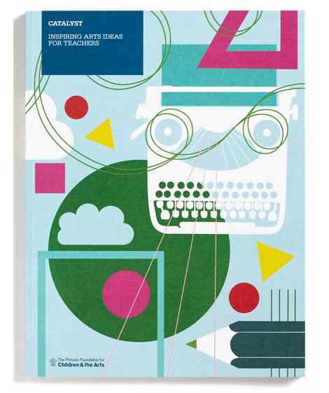
The piece above is one of a series of posters that paris based designer Jacques Nathan Garamond produced for Telefunken. I just wish I could cut out that Telefunken logo. It kind of kills the vibe of this poster. You have all these round edges on the type and the reel to reel player and theres this crazy sharp edge ninja star with lightning bolts.
During the 1950-1960s Garamond began deconstructing objects into geometric shapes. This is evident in the print above as well as his poster work for Air France. I’ll try to scan in some of the Air France posters when I get a chance.
Giant Golden Book of Biology - An Introduction to the Science of Life c1961
Text by Gerald Ames and Rose Wyler - Illustrated by Charley Harper
It doesn’t get much better then this. This is Charley in his prime.
“In a style he called “minimal realism”, Charley Harper captured the essence of his subjects with the fewest possible visual elements. When asked to describe his unique visual style, Charley responded:
When I look at a wildlife or nature subject, I don’t see the feathers in the wings, I just count the wings. I see exciting shapes, color combinations, patterns, textures, fascinating behavior and endless possibilities for making interesting pictures. I regard the picture as an ecosystem in which all the elements are interrelated, interdependent, perfectly balanced, without trimming or unutilized parts; and herein lies the lure of painting; in a world of chaos, the picture is one small rectangle in which the artist can create an ordered universe.[cite this quote]
He contrasted his nature-oriented artwork with the realism of John James Audubon, drawing influence from Cubism, Minimalism, Einsteinian physics and countless other developments in Modern art and science. His style distilled and simplified complex organisms and natural subjects, yet they are often arranged in a complex fashion. On the subject of his simplified forms, Harper noted:
I don’t think there was much resistance to the way I simplified things. I think everybody understood that. Some people liked it and others didn’t care for it. There’s some who want to count all the feathers in the wings and then others who never think about counting the feathers, like me.”
Luke Williams is a third year graphic design student at the Maryland Institute College of Art. While making sweet calendar-meets-packaging cubes, he is also working for Abbott Miller/Pentagram in Baltimore. From magazine and book layouts to posters and self-initiated work, Luke’s work is fresh. It’s nice to see a large body of work with this much variety, attention to detail, and experimentation with other mediums.
Portland based designer Gavin Potenza (Exploratory Design) has cooked up a series of sweet stamps. The series which was inspired by the work of Otl Aicher is entitled Homage to the Stamp.
Alexander Girard alphabet blocks designed and produced by House Industries
Many thanks to the guys at House Industries for sending over a box of goodies. Included in the box was a set of Alexander Girard alphabet blocks. These blocks were the result of a collaboration with the estate of mid-century designer Alexander Girard, the 28 wood blocks feature alphabets based on the forthcoming Alexander Girard font collection and a cleverly-adapted House Industries factory logo puzzle. I have been jocking these blocks since day 1. They have been on my want list for a while. My wife and I don’t have kids yet, but when we do, I can tell you one thing for sure. There is no way the kids are going to touch these! ha! These are daddy’s blocks!
BarryBlog has posted a rare glimpse of some in-house publications for Herman Miller. They were produced in conjunction with the great design thinker Ralph Caplan, and designed by John Massey of Container Corporation of America fame. I’m drooling! I’d love to read these. Maybe we can get the good people at Barry Blog to make photo copies.
The battlefields of Arnhem and Oosterbeek in the Netherlands never looked so good as they do in Pink and Teal. The battles were part of Operation Market Garden. It was here that the famous “First Airborne Divison” consisting of more then 8000 men, under the command of Major-General Urquhart, glided down to earth on the morning of Sunday September 17, 1944.
The scaley, snake looking trail in the lower half of the map represents the Rhine River. The battlefields can be seen as the solid patches of brown. I really appreciate how the map designer cut away the airplane and parachute icons from that mass of brown. Simple, effective and creates some interesting shapes within the negative space.
On a sidenote, watched “King of Kong” this weekend. Great flick. Definitely biased in its presentation but none the less Billy still comes off like a really sorry bob. After all the talk of competitive gaming and playing in front of people, I was surprised that he didn’t step up to the challenge at the Guinness event in Florida. Thoughts?
Many thanks to Laurent for sending me this animated short. After watching it, I couldn’t believe that it’s a student film. It looks like something straight out of PIXAR. Laurent mentioned that films, cartoons and design from the 1960s were the inspiration for the project. Excellent animation and great use of James Bond soundtracks to set the atmosphere.
Have a great weekend everyone!
Speaking of which, after getting a tip from my friend Wes I decided to rent “King of Kong”. Thats on the playlist for the weekend. Anyone else seen this?