Lamosca

Lamosca

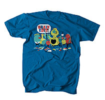
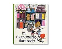
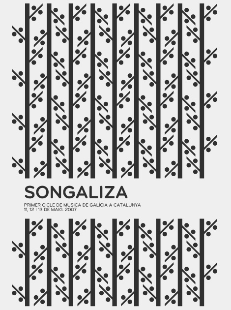
Some of the work from Lamosca is pretty familiar, but I became reacquainted with them through a weave of who-did-what for a recent IBM campaign. One of the things they handle quite nicely is the combination of layout and illustration. Their colorful and bold illustrations give the work an immediate pop, but it’s paired nicely with legible, insightful layout. It’s nice when those two can live together in harmony.

Their work feels consistent and jives as a whole, without feeling bored, tired or expected. Among their standout work is their info graphics — which have a quirky, colorful liveliness that isn’t often seen in that area of design.

Read the rest of this entry »

2011: Living in the Future

Geoffrey Hoyle

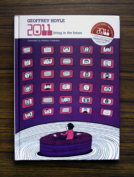
2011: Living in the Future was originally published in 1972, but has now been brought back to print upon realization of the book’s accuracy, inaccuracy, and irony. Geoffrey Hoyle, a science fiction author, future visionary, and product of his astronomer father, wrote the original text, predicting such glorious technologies as “vision desks,” “vision phones,” and personal automated breakfast factories. There is also talk of people only working 3 days a week, with a traffic-free commute. Playfully illustrated with wonderful projections of our modern-day utopia by Alasdair Anderson, this quick read would be great for both the coffee table and story time with the kids, so they can think about what those crazy people in the 70s were like.

Read the rest of this entry »

Designers for Japan

designers for japan
To Japan by Christopher Gray

Designers for Japan is a collective of imagemakers from around the world who were spurred on by the catastrophe of March 11th to do something, anything to help and to express our love for our friends and colleagues in Japan. Thanks to Print-Process & Creative Review, prints are for sale at £30 for A2, £60 for A1 with all proceeds after print, paper and postage going to the The Red Cross / Shelterbox. In addition, there are plans for an upcoming charity auction. If you would like to contribute or help in anyway, please contact them at [email protected].

Read the rest of this entry »

Jessica Walsh

Jessica Walsh is one of those people that, as a designer, is everywhere at once. Since her work encompasses such a wide array of styles that you’ve probably seen something that she has created without knowing that she did it, which is probably what makes Jessica such an excellent Art Director. She has a great way of putting a fresh spin on each project that comes her way, and I’m excited to see what she produces in the future as an artist & at her latest postion with Sagmeister, Inc.

Read the rest of this entry »

Introducing Liz Meyer

Liz Meyer

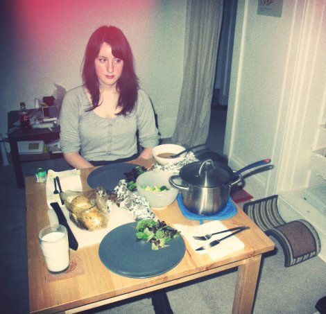
As you may have noticed, a new name has been covering all things typography related on Grain Edit. The name’s Liz Meyer, and it should ring a bell. Liz is a talented designer and illustrator based in Brooklyn, one half of Script & Seal, and the newest addition to our Grain Edit crew.

There’s more to Liz than just her love for Thanksgiving, as evidenced by the photo above. To give you a better feel for our East Coast correspondent, we’ve conducted a little interview with her that you’re sure to enjoy! Without further a do, please welcome Liz…

Read the rest of this entry »

Carl DeTorres

carl detorres

I love the range of work from Oakland, CA based designer Carl DeTorres. With multiple projects from Wired and IBM (among others), Carl’s work communicates very clearly. His directness and visual viewpoint, combined with his inventive form making and interesting palettes make for consistently compelling design.

Read the rest of this entry »

Center of Attention – Vintage 7″ Labels

Simon Foster

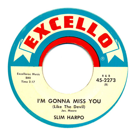
Center of Attention is an online collection of vintage record center labels by designer Simon Foster. Simon’s collection contains some real colorful gems of labels, which seem to be mostly from the 60’s and 70’s, although he has a few more antique examples. Although the aging crisp graphics, imperfect printing, and retro typefaces are super intriguing, my favorite thing about these old labels are the classic song titles; with such great hits as “I’m Gonna Miss You (Like the Devil),” “T-R-A-M-P,” “The Machine Demands a Sacrifice,” and “Fattie Bum Bum.”

Read the rest of this entry »

From the Job Board

designer jobs

Recently Added to the Grain Edit Job Board:

Graphic Designer/Illustrator – fredflare.com (Brooklyn, NY)
Data Editor – GOOD (Los Angeles, CA)
UI Designer – GOOD (Los Angeles, CA)
Senior UI Designer – GOOD (Los Angeles, CA)

You can subscribe to our job listings via RSS, Email or follow at Twitter and Facebook.

Read the rest of this entry »

Network Osaka

network osaka

Network Osaka is a wittingly self-proclaimed “artist pretending to be a designer” (I’m too used to seeing it backwards). With the presentation, style, and workload of a full-on design studio, he creates strikingly bold and intimidatingly intelligent, yet beautifully simplistic imagery. What I really love most about Derek’s work, however, is that he has a great sense of when and how to use heavy, solid bodies of color. Some of my favorite graphics are from 26 piece alphabet card set with Artist As Citizen; “Extinct”. Derek Kim, as he also is known as, is a Parsons graduate with a BFA in communication, carrying a respectable client list which holds such names as Wieden+Kennedy, Nike, Esquire, and YWFT.

Read the rest of this entry »

Christopher Gray

christopher gray

Christopher Gray is a modern day Renaissance man that works as a designer, illustrator, photographer, and writer. His personal poster work features amalgamated geometric shapes in sophisticated compositions and color schemes.  Christopher is setting the bar high on this project, and writes on his blog that he’s aiming to get 100 posters in the middle of [the] year all of which will be for sale. There’s no doubt that we will be seeing more exciting work from him in the future!

Read the rest of this entry »