Search Results

Your search for book cover returned the following results.

Polish Book Cover Contest

polish art

Our friend Will over at 50 Watts (formerly A Journey Around My Skull) is holding a fun contest. Participants are encouraged to design a Polish edition of their favorite book. Top prize is $400 with runners-up winning some snazzy books including One Thousand Polish Book Covers by Aleksandra and Daniel Mizieliński and Born Modern: The Life and Design of Alvin Lustig.

Read the rest of this entry »

European Book Covers

Grain Edit book covers

Wow! Great collection of European book covers from A Journey Round My Skull. So fun to look through. I love the balance of naiveté and compositional sophistication throughout these jackets. It’s amazing the depth that is achieved through simple illustrations and good color choices.

Read the rest of this entry »

Polish Book Covers

polish book covers

Will over at the excellent Journey Round My Skull posted an amazing collection of Polish book covers. There is some seriously wacky stuff going on these book jackets. Whats up with beard face?

Read the rest of this entry »

18 Dick Bruna Book Covers

dick bruna

Dick Bruna- Book covers

Lets start the week off right. How about a dose of Dick Bruna book covers.

Read the rest of this entry »

1960s Brazilian book cover designs by Gian Calvi

Gian Calvi book cover designs

Plantão Fatídico é de c1967 -O Assassino Nudista c1968 – No Calor da Noite c1968.

Beautiful book covers by Brazilian designer/ illustrator Gian Calvi. Very similiar to the Penguin book covers of the same time period.

I’m very interested in Brazilian design from the 60s and 70s, so If anyone has any images or info please send it my way.

(via design ref’s wonderful flickr set)

also worth checking:

Japanese book cover art from the 1960s

tholon kunst – book cover design

tholon kunst design

Book cover for Jules Verne novel

Lots of great work to see at Argentinian design firm tholon kunst – Book covers, annual reports, logos and a cow grazing on a prime patch of white space.

Modern book cover art – Creative America

creative america-cover

Creative America: Art director- Albert Squillace c1962

Thanks to Chad for sending this in. Looks very similar to the book cover design work of Paul Rand.

Also worth checking:
Modern Dutch book cover design
1960s Penguin books

Japanese graphic design – book covers

Japanese graphic design - book covers from the 1960s
1960s Japanese book cover designs

I don’t know much about the company that published the book on the right, but the book on the left was published by Kappa in 1963. Keep your eyes out for Kappa, they have other cool covers.

70s design – Jazz book covers

70s book design - Dan Haerle jazz book covers

70s book design - Dan Haerle jazz book covers
(t) Jazz/ Rock voicings for the contemporary keyboard player c1974
(b) Jazz Improvisation for keyboard players c1978

I picked up these two books over the weekend. They are part of an instructional jazz book series produced in the 1970s for Studio publications and recordings. I’m not sure who responsible for the cover design but, I like how he limited it to a few simple shapes and the type. Both books are written by Dan Haerle, but there are others in the series by Rufus Reid and Ramon Ricker.

Staffan Wiren book cover illustration

Staffan Wiren book cover illustration
VÃ¥rt svenska samhälle – by Sixten Björkholm c1963

Cool book cover illustration by Staffan Wiren. Great example of swedish modern illustration from the 1960s.

On a sidenote, just talked to my friend Joe Beats and he’s got a killer mix online that he put together for designer vinyl toy store Munky King. Listen to the mix here.
HIGHLY RECOMMENDED!

(Staffan Wirén book cover via David at the Klockarp institute)

Hans Kleefeld book cover design

Hans Kleefeld book cover design
This Land – A Geography of Canada by Edward Wahl c1961
Hans Kleefeld cover designer

Great book discovery by Rosemary Travale.
Hans also designed the original logo for the Toronto Zoo.

Dick Bruna book covers

Dick Bruna book covers

Some great book covers in the Dick Bruna Flickr group.

(image via onno de wit)

Penguin books – Book cover design

Penguin book cover design
1960s penguin book covers

Things magazine..wheew sweet mother! They have put together a kick butt gallery of penguin book covers. Includes beautiful covers overseen by Jan Tschichold as well as the late typographer Hans Schmoller. My favorite years are between 1961-1972 when Italian art director Germano Facetti was in charge of design. Facetti enlisted Polish graphic designer Romek Marber to redesign the look of the Penguin series and the rest is history.

Side note: Watched Jules Dassin’s Brute force last night. Great Flick. I also recommend Riffifi which was directed by Dassin as well.

(via Ace jet 170)

61 books with black type on white cover

61bookswithblacktype

Bernd Kuchenbeiser’s 61 books with black type on white cover lovingly pays homage to the printed word in all it’s glory. Created for a recent event at Vitsoe’s Reading Room, the book also serves as an analog companion to his impressive blog. Contained within is a cohesive collection of titles bound initially by the color (or lack of) of their cover. Accompanying each entry is a brief paragraph that details the qualities whether physical or conceptual that have attracted Bernd’s attention. Available at select Vitsoe shops, the book is free while supplies last.

Read the rest of this entry »

Dave @ Book By Its Cover

 Julia Rothman - Book by its cover blog

All this week I will be guest blogging at Julia Rothman’s wonderful Book By Its Cover blog. This is one of my favorite blogs, so please stop by! Today’s posting is a beautiful book by Tim Biskup.

AIGA 50 Books/50 Covers at Chronicle Books

Arboretum Cover Designed by McSweeneys

Cosponsored by Chronicle Books, the San Francisco Center for the Book, and the San Francisco chapter of the American Institute for Graphic Arts, this year’s annual 50 Books/50 Covers show, which has been held at the SFCB for the past several years, moves over to the new Chronicle Books headquarters at 680 Second Street. The above sample gives you a glimpse of the talent you will be reviewing. ‘Arboretum’ cover designed by McSweeney’s Publishing.

Opening reception: 680 Second Street, San Francisco
Friday, Oct 26 from 6-8pm and is free to the public.

Please visit the ‘San Francisco AIGA’ website for more details.

Recently Received Books

This is Miroslav Sasek

In our latest edition of book picks we highlight titles from Wee Society, Intercom, Universe/Rizzoli, Laurence King, TBW Books, HarperCollins and Princeton Architectural Press. In addition, we take a look at a stunning new typeface from Lost Type. All this and more after the jump.


Read the rest of this entry »

Recently Received Books

The Moderns via @grainedit

The Moderns by Steven Heller and Greg D’Onofrio

Looking for some new inspiration or something to add to your winter reading list? Here’s a few of the titles that we’ve received within the last month or so. Included are awesome titles from Abrams, Blast Books, The Monacelli Press, Thames & Hudson, Wee Society and Princeton Architectural Press.


Read the rest of this entry »

Book Kickstarters

Munchen Collected 1972

Are you a fan of design and type related books? If so, these Kickstarter campaigns might be of interest to you. The first supports a stunning reference book on the 1972 Munich Olympic Games’ identity system. The second is a detailed biography on designer W.A. Dwiggins. Learn more after the jump.

Read the rest of this entry »

2016 Holiday Gift Guide: Design & Illustration Books

Grain Edit's 2016 Holiday Gift Guide

Here it is! Our annual Design Book Gift Guide! In this list, we’ve compiled our favorite titles from the past year. We hope this helps you find the perfect gift for your loved ones this holiday season.

Read the rest of this entry »

Alex Trochut’s Penguin Books Galaxy Series

Alex Trochut

Alex Trochut’s covers for the Penguin Books Galaxy Series beautifully capture the unique essence of the captivating stories that made each book a pioneer of its time. The covers’ typographic compositions and bright colors are inspired by the books’ settings and narratives. For Robert A. Heinlein’s Stranger in a Strange Land (1961), Trochut cleverly arranges the type to highlight and represent the clash of views addressed in the novel. The word “stranger” appears facing a different direction than “strange land.”


Read the rest of this entry »

New Metaphor Books

New Metaphor

New Metaphor Books is a new online bookstore that specializes in rare and unique books that focus on graphic design, film, architecture, fashion, and photography. The shop’s collection features diverse views on each art form and is a true treasure trove of amazing out of print books.

Read the rest of this entry »

2015 Holiday Gift Guide: Design Books

Design book gift guide

Here it is, our annual book gift guide! Below you will find over 30 titles from our favorite publishers. Included are our top picks for illustration, graphic design and typography. Enjoy!


Read the rest of this entry »

New Additions to our Holiday Book Gift Guide

Hello I am Erik

If you’re looking for last-minute gift ideas, we’ve got you covered. We received some exciting new titles this week, just in time for the holidays. Included in the list below are titles from Gestalten, Lars Muller, Kat Ran Press and Metropolis Books. These titles along with many others can be seen in the full version of our Holiday Book Gift Guide.


Read the rest of this entry »

2014 Holiday Gift Guide: Books

Design book gift guide

Here it is, our annual book gift guide! Below you will find over 30 titles from our favorite publishers. Included are our top picks for illustration, graphic design and typography. Enjoy!


Read the rest of this entry »

2013 Gift Guide: New & Recent Books

map the world

If you’re looking for holiday gift ideas, here are a few suggestions. We’ve compiled our favorite books from the past year into one giant list. Included are titles focused on editorial design, typography, identity work and brainstorming.

Read the rest of this entry »

Gift Guide: New & Recent Books

design books

If you’re looking for holiday gift ideas, here are a few suggestions. We’ve compiled our favorite books into one giant list which include illustration and design titles from larger publishers, as well as privately pressed items.

Read the rest of this entry »

Book Gems from the South of France

On a recent and most adventurous trip to the South of France, I had the pleasure of visiting the small village of Montolieu. Known as the “Village of Books,” Montolieu has a grand array of artisans that specialize in book binding and printing as well as antiquarian bookstores specializing in everything from vintage periodicals and antiquities to comics, art and kids books.

Today’s post will unearth some of my favorite finds from my trip, including books illustrated by J.P. Miller, Charley Harper, and Alain Gree.

Read the rest of this entry »

Handbook of Pictorial Symbols

Handbook of Pictorial Symbols

With a collection of 3,250 glorious icons, Handbook of Pictorial Symbols is great inspiration for any designer. Gathered from sources from around the world, these elegant yet minimal icons are a reminder that simplicity is truly key. Below is a small selection of my favorites from the book.

Read the rest of this entry »

Creative, Inc. Book Tour

creative inc

Our good friends at Chronicle Books recently released Creative, Inc.: The Ultimate Guide to Running a Successful Freelance Business. Co-written by Joy Cho and Meg Mateo Ilasco, this helpful guide is packed with expert advice on finding agents, negotiating fees, licensing work and dealing with taxes. Also included are useful resources and interviews with experienced designers and illustrators.

I’m excited to welcome both Meg and Joy to Grain Edit today for a special Q&A session. Ok, here we go!

Read the rest of this entry »

Power Styling: Futuristic Power Structure Concept Book

power styling united states steel

In 1964 United States Steel called upon the nation’s electric utility companies to reconsider the current look of our power stations and transmission towers to be both functional and beautiful. Two years later, Henry Dreyfuss and Associates were commissioned to investigate possible design alternatives, and I believe they were documented in a book entitled “Power Styling” which was produced by United States Steel in the mid-to-late 1960s. I discovered a copy not long ago, and the inside illustrations are absolutely amazing. Unfortunately, there is very little information listed, so I can’t say for sure if the concepts belong to Henry Dreyfuss and his team. I contacted the office of Syd Mead, who did several illustration projects for US Steel, to confirm the artwork, and sadly he was unfamiliar with this piece. If anyone has information on the Power Stylings project or the mysterious illustrator, please drop a note in the comments.

More images after the jump. Don’t miss this one!

Read the rest of this entry »

Celestino Piatti + dtv Book: The Unity of the Program

 alt=

Celestino Piatti + dtv: The Unity of the program – Edited by Jens Muller

Two weeks ago we featured the Philips-Twen book from Lars Muller’s new A5 series. Celestino Piatti + dtv is the third title to be released in the series and my favorite of the bunch.

Celestino Piatti was born in the little Swiss village of Dietlikon on January 5,1922. Early on his parents recognized his talent and secured him training at the Kunstgewerbeschule (School of Applied Arts) in Zurich and later a graphic design internship with fellow Swiss designer Fritz Buhler. After four years with Buhler he left to start his own studio and eventually landed the job of a lifetime. In 1961 Deutscher Taschenbuch Verlag (dtv) hired Piatti to design their bookjackets. A comission that lasted up to his death in 2007. For over thirty years, he endowed the books published by dtv with a singular and unique look. He became the most productive book designer of all times, producing covers for over 6300 books that sold in a total print run of over 200 million copies.

Read the rest of this entry »

Vintage German “Vero Construc” Booklets

Vero Construc, Germany, Graphic Design

Vero Construc toy construction kit -1975

Nuts, bolts, and sprockets! These are the makings of fine toys, as well as these awesome vintage booklets!

Created for the East German toy company Vero in 1975, these colorful booklets itemize all of the pieces included in the “Construc” construction kit and instructs children in building a stop light. The back cover reads, “Toys With System for the Creators of Tomorrow’s World.” How inspiring!

Read the rest of this entry »

Philips-Twen Book: Realism is the Score

philips twen book

Philips-Twen: Realism is the Score – Edited by Jens Muller

Just got my hands on a few of the Lars Muller A5 titles and they don’t disappoint. I’ll try to get photos of all three titles up on grain edit within the next week or so. Unfortunately these titles are unavailable in the U.S right now, but should be available soon. Amazon has a release date of October 1st.

Read the rest of this entry »

Lars Muller’s New A5 Book Series

orba squara

Celestino Piatti and dtv: The Unity of the Program – Edited by Jens Muller

I can’t wait to get my hands on these books.

Lars Muller has just launched the A5 series of books. The series is intended as a growing archive on graphic design. Each volume introduces outstanding personalities and important themes from the history of international graphic design, with numerous illustrations, essays and interviews. The series kicks off with books focused on Celestino Piatti, Philips-Twen and Hans Hillmann.

I’m really excited about the Celestino Piatti book. For more than 30 years, he endowed the covers of books published by dtv with a singular look. With more than 6300 covers to his credit, amounting collectively to a total of 200 million volumes, Piatti was one of the most productive designers of all time.

Read the rest of this entry »

Designer’s Bookshelf: Sam Grawe of Dwell Magazine

sam grawe

Innovations – Illustrations by Syd Mead

The last time we mentioned Sam Grawe on grain edit we were drooling over his collection of ceramic owls. Sam is the Editor-in-Chief of Dwell and member of the ultra cool nu balearic cosmic disco band Windsurf. Here for grain edit readers Sam shares pictures of some of his favorite books and the stories behind his finds. Enjoy!

Read the rest of this entry »

Designer’s Bookshelf: Amy Cartwright

Amy Cartwright is a talented illustrator who designs and illustrates cards, books, and other products for clients including: Hallmark, 3M, Scholastic, and Proctor & Gamble. In her spare time she curates one of our favorite blogs, Stickers and Stuff. The blog showcases vintage kids books and wonderful examples of modern design. Here for grain edit readers Amy shares pictures of some of her favorite books and the stories behind some of her finds. Enjoy!

And now over to you Amy…

Read the rest of this entry »

Vintage Cassette Tape Covers

vintage cassettes

Bruce Jamieson of the top notch design firm I Love Dust emailed me about this diamond mine of vintage cassette tape inserts he just uploaded to Flickr. The collection includes covers from Happy Sound, Bonsonic, Philips, BASF, WHSmith, Emitape, AGFA, TDK and a grip of others.  Lots of great material from the 1970s and 80s.

Read the rest of this entry »

1960s Zurich Booklet Designed by Franz Fassler

Zurich Switerland Map

Zurich Excursions 1963-Printed by Orell Fussli in Switzerland

The Swiss do it again! Top notch layout by Franz Fassler. Fassler also designed the cover of anwendungstechnik moderner anstrichstoffe seen in our post on modern Swiss book design. This booklet contains information on escorted and non escorted tours around Zurich.

Read the rest of this entry »

Yearbooks, Trapdoors and Fish Sticks

mirage 68 yearbook

Found this 1968 yearbook for Depauw University a month ago. I have no idea how the island looking thingys tie in with the school, but I’m really digging it. I think I’m going to chop the front cover off and frame it. Anyone else have any ideas? Maybe I could use the top to make a series of designer trap doorsMirage might be a fitting title for that. Trap doors will be the hot thing in 2009, just wait and see. I’m also looking to heavily invest in secret underground passageways and fish sticks. If you have a cave and box of Gorton’s….let’s talk.

Read the rest of this entry »

Vintage Electronics and Music Concrete booklet

Nieue muziek by Gerard de wit

Nieuwe Muziek – Concrete en elektonische muziek by Gerard de Wit c1968

Great cover photo of a dutch recording studio from the 1960s. Check out all the vintage analog recording equipment! So many buttons, switches, knobs, reel to reels and dials. If your into 60s computer interfaces, tape machines and old mixing boards, I highly recommend you check out Stewf’s amazing Control Panel Flickr group.

Mucho  thanks to Chris at Groove Merchant for hooking me up with the booklet.

Pino Tovaglia book – Exhibition of design work

[pictobrowser 10159078@N03 72157604060512778]

Pino Tovaglia book – The rule that corrects emotion

In addition to this blog, I own a small design bookstore. As a bookseller, I find it hard to find publishers that consistently produce quality titles. Italian publisher Edizioni Corraini is one of a few publishers that I look forward to their new releases each year. If you own or have seen any Bruno Munari books, you are most likely familiar with their work. They have reproduced dozens of Munari’s books, many of which I own in my personal collection. In addition to the Munari collection, they have produced books on or by Martí Guixé, Enzo Mari, Aoi Huber-Kono (Max Huber’s wife),Taro Miura, Albe Steiner and many others. With this in mind, I was delighted when I received an email from them mentioning that they had been reading Grain Edit and that they would like to send a package my way.

I will cover the contents of the package in several posts. The first being the Pino Tavaglia book seen above.

Read the rest of this entry »

Modern dutch paperback cover design

dutch paperback boook cover design
(L) designer: unknown ©1966 (R) designer: J. Venema ©1966
Published by Aula-Boeken in the Netherlands

The recent excitement over Penguin covers has resulted in a renewed interest in paperback book cover design. I’m starting to see discussion groups popping up as well as new books being published on the subject. Several titles come immediately to mind; Seven Hundred Penguins and World Paperback design. In future posts I’ll discuss both of these books as well the as the book covers of dutch designer Dick Bruna. For now enjoy the pieces above.

For further viewing on the subject I Highly recommend:
Ace Jet 170 : Loads of great material here and one of my favorite blogs
The Old timey paperback book covers group on Flickr

(pictures via) world paperback design

10 years of Vendre design magazine covers

[pictobrowser 10159078@N03 72157603295091286]

10 years of Vendre design magazine covers (Best of 1952-1962)

Vendre was a monthly trade magazine for graphic designers in France. It was founded by Etienne Damour in the 1920s. The magazine’s chief editor was Roger-Louis Dupuy, who in addition established one of the first advertising agencies in France. Paul Nicolas would later become chief editor and guide the magazine through the 1950s and 60s. During this time period the magazine was mostly text-based. The articles dealt with the creative and technical challenges its readers would of faced.

The issues above are some of my favorite cover designs for Vendre between the years 1952 and 1962. Illustrators and designers for these issues include Rene Chag, Ducordeau, M. Legand, Paul Funken, Roger Troubat, Francois Szalay and Henriette Mayo.

If you are interested in Vendre or the history of French graphic design, I highly recommend you pick up a copy of Michel Wlassikoff’s The Story of Graphic Design in France. It is an excellent overview of the design work this country has produced in the last 100 years.

Designers bookshelf: Sean + Nicole Flores

sean_nicole_flores_book_collection
When grainedit asked us to show our book collection for their blog, we were pretty excited. Getting it done, however, was half the battle. Not that we were lazy, okay, we were a little lazy, but the hard part was figuring out what stuff we liked the most.

It’s not that easy, here’s how it went:
Sean: [Looking though first shelf] “Oh, I like this one, this one too, we should put this one in”

Nicole: [sighs] How many do you plan on doing? That’s too many.

So here you go, a look at our bookshelf and here are some of our favorites.
Read the rest of this entry »

Keith Negley

Keith Negley

Keith Negley is an award-winning illustrator whose drawings easily transition between organic line work and rigid collaged compositions. His illustrations have appeared in national magazines, such as the New Yorker and Newsweek, where he’s covered subjects such as racial discrimination, medicine, and entertainment. In addition to his editorial work, he’s designed striking book covers and contributed to collaborative zines and gallery shows. He’s also published two books of his own titled My Dad Used to Be so Cool and Tough Guys (Have Feelings Too).

Read the rest of this entry »

Recently Received

Release the Hounds

We’ve recently added a ton of great books to our shelves including titles from Princeton Architectural Press, Rizzoli, Laurence King Publishing, Thames & Hudson, and more! See them all after the jump. Enjoy!

Read the rest of this entry »

Recently Received

The NASA Graphics Standards Manual

We’ve received some awesome titles from Nobrow Press, PIE International, Rizzoli, Standards Manual, and more. Also included are rad bandanas designed by Hitch, gorgeous linen journals from House Industries, and a collection of architecturally-inspired rubber stamps by Aurelien Debat. Check them all out after the jump.

Read the rest of this entry »

Jacob Escobedo

Jacob Escobedo

If you’ve recently walked into a record store or flipped through the TV channels, you’ve probably seen the art of Jacob Escobedo. In addition to being the VP of creative design at Cartoon Network and Adult Swim, he immerses himself in a number of side projects. He’s designed album covers for bands, such as The Shins and Broken Bells, and crafted editorial illustrations for The New Yorker, MIT Technology Review, and other prominent publications. Highly influenced by vintage sci-fi book covers and artists like David Pelham and Jean Giraud (AKA Mœbius), his work is filled with galactic scenery and otherworldly characters. These cosmic compositions radiate with pink, blue, and purple rays of light that beautifully glisten against the darkness of outer space. Similar colors are also present in his series of album covers for Adult Swim Singles, a collection of free songs by contemporary musicians. The artwork’s marbled and oozing colors look as though they are dripping before your eyes. This optical illusion is brought to life on the project’s website where the illustrations are transformed into interactive animations.

Read the rest of this entry »

Lucy Jones

Lucy Jones

Lucy Jones is an illustrator, designer, and printmaker based in the UK. She often designs posters for musicians and music festivals and takes on self-initiated projects such as designing book covers for stories in The New Yorker. Brimming with collaged photographs, loose brushstrokes, and handwritten scripts, her work is refreshingly uninhibited. By combining these elements with a small handful of colors and typefaces, Jones creates a signature style that is playful and unabashed.

Read the rest of this entry »

La Boca Update

La Boca

Since we last featured La Boca, they have continued to craft vibrant and work that summons feelings of nostalgia. Striving to create emotional connections through pop culture, they design retro-inspired posters, book covers, and album sleeves for clients such as 21st Century Fox, Penguin, and Adele. Their thoughtful and unique approach has not gone unnoticed and has earned them a slew of awards including numerous European Design Awards and Annual Design Awards. To get your hands on their colorful prints make sure to check out their shop.

Read the rest of this entry »

Edgar Bak

Edgar Bak via http://grainedit.com

Edgar Bak is a talented designer based out of Poland. A graduate of the Academy of Fine Arts in Warsaw, he can now be found art directing for various magazines and teaching typography and information architecture classes at the School of Form in Poznan. He was also a driving force behind Projekt: The Polish journal of visual art and design published by United Editions. Read the rest of this entry »

Sponsor // Respublika Font Family

Made up of 10 unique styles, Respublika FY, from FontYou, is a gorgeously balanced humanistic sans serif font. Complete with 10 different styles ranging from light to extra black italic, there’s pretty much nothing this titanic typeface can’t do! And for a limited time only, you can get the entire family for 88% off thanks to this Mighty Deal!

Read the rest of this entry »

Irving Harper: Works in Paper

irving harper

Irving Harper: Works In Paper is a recent monograph from Skira Rizzoli celebrating the multi-faceted designer, Irving Harper, with a focus on his incredible collection of paperboard sculptures.

As the director of design at George Nelson Associates in the 1960s, Harper contributed to numerous mid-century creations, namely the Marshmallow Sofa for Herman Miller furniture and the Ball and Sunburst clocks for Howard Miller, and also leading the design of the Chrysler pavilion for the 1964 New York World Fair. According to Julie Lasky who penned an essay for the book, the pressure of work ‘almost drove him to knit’, yet with his skills in building client presentation models in cardboard, he soon eased his way into sculpting with paper. Inspired by Picasso, African Art, Surrealism and de Stijl, Harper constructed whimsical characters and breathtaking abstracts mostly out of paper in addition to straws, wood, toothpicks, twigs, spare materials from his office and discarded doll parts from his daughter. His collection numbered close to 300 when he ran out of display space in 2000. He completed his stunning final piece which appropriately graced the book cover – an owl with glass eyeballs and draped in folded brown paper feathers.

Read the rest of this entry »

/Sponsor/ Boxshot

Boxshot is a realistic 3d mockup software, allowing designers to provide 3d visualization of artwork for customers.

It features 50+ shapes like 3d ebook covers, 3d boxes, CD and DVD boxes, binders, stationery, bottles, cards and much more. It also has the ability to load various 3D formats in case the shape you need is missing. In addition, Boxshot automatically adjusts the shapes to your artwork.

State of the art user interface and support of both Windows and Mac platforms make Boxshot a killer solution for professional designers. Give it a try now, while the discount (no code needed) is still valid!

Interested in sponsoring the Grain Edit Feed? Visit our sponsorship page for more info.

Recently Received

mati klarwein

From books on vintage record cover art to typographic notecards, here’s the latest batch of items to hit our shelves.

Read the rest of this entry »

Jonathan Gray

jonathan gray

I’m so impressed with the consistently impressive, type-driven book cover work of Jonathan Gray. Generally, his covers are predominantly typographic, but they don’t operate under a single, rehearsed style. There’s so much variety and life to his body of work; it’s amazing to see all of this coming from one person.

Read the rest of this entry »

Recently Received

louise fili

Here’s the latest batch of books to hit our shelves. This week includes picks from Princeton Architectural Press and Chronicle Books.

Read the rest of this entry »

Elena Giavaldi

Talented designer and illustrator Elena Giavaldi really knows how to make judging a book by its cover easy. As a book cover designer, she creates very cool, contemporary compositions for some of the best publishing houses in the business. She also manages to put very personal touches on each project, and add a bit of extra interest with unique type choices and very modern, experimental lettering. Other than her expansive covers archive, her portfolio runs the gamut of graphic design, making her an incredibly versatile designer. To keep up with Elena, look for her work in a bookstore near you!

Read the rest of this entry »

Julianna Brion

julianna brion, illustration

Julianna Brion is a Baltimore, MD based illustrator with a wonderful eye for details and beauty. She creates memorable images, such as this book cover illustration for Roald Dahl’s James and the Giant Peach. I love the way she uses pencil in all of her work, which has a nice textural quality that I can’t get enough of.

Read the rest of this entry »

John Gall

john gall

One of my favorite book cover designers, John Gall, has a new site up and running. John is a designer with an incredible stylistic range — I love how he is so able to design for such a variety of titles and narratives.

Read the rest of this entry »

Recently Received

graphic design books

Here’s the latest crop of books to hit our shelves. This week’s entry includes titles from RizzoliChronicle BooksLaurence King and Hyphen Press.

Read the rest of this entry »

Will Staehle

Will Staehle

The work of Will Staehle is inventive with an incredible range of style and content. You might know of him because of his artwork aptly named the Silhouette Masterpiece Theatre, using silhouettes and some delightfully snarky text. Most of his design and type work is with his studio, Lone Wolf Black Sheep—producing iconic book covers, recognizable as some of the best selling books in recent years. He also has a really interesting blog of sorts, called the Dollar Dreadful Family Library, featuring amazing Victorian display type.

Read the rest of this entry »

Mimmo Castellano: Posters and Packaging

Mimmo Castellano

Mimmo Castellano is an award-winning graphic designer and photographer who got his start in the port city of Bari located in the South-East corner of Italy. It was here that he landed a position with Laterza, a prominent publishing house, where he designed many of the book covers. This collaboration would last for over twenty years. In the late 60s he moved to Milan to further his career as a designer and taught at the European Institute of Design. In more recent years he has been researching digital imaging connected with photography and photomechanics.

Read the rest of this entry »

Kazumasa Nagai Posters

Kazumasa Nagai Posters

Pink Tentacle digs up an impressive collection of posters by Japanese artist and designer Kazumasa Nagai. Enjoy!
Read the rest of this entry »

Cor Klaasen: Vintage Irish Graphic Design

cor klaasen

Opening in Dublin this week:

The Vintage Irish Book Covers blog is presenting an exhibition of Cor Klaasen’s wonderful book and record cover designs.

Cor Klaasen: Jackets, Covers & Sleeves
Venue: Adifferentkettleoffishaltogether, 18 Ormond Quay Upper
Times: Daily 11 – 5pm. Thurs 4 – Wed 10 November inclusive
Opening: Wednesday 3 November, 2010, 6 – 8 pm. Guest Speaker: Brian Lalor

Read the rest of this entry »

Born Modern: The Life and Design of Alvin Lustig

alvin lustig born modern

I’m so excited, I just got my hands on a copy of Born Modern: The Life and Design of Alvin Lustig. After several years in the making, the highly anticipated book by Steven Heller & Elaine Lustig Cohen (Alvin’s wife) was finally released by Chronicle books last week. This is the first monograph devoted to this master of modern design, whose brief but prolific career had a profound and lasting influence on a generation of designers to come.

Read the rest of this entry »

Isaac Tobin

grain edit / isaac tobin

Fantastic book covers from Isaac Tobin, a senior designer for Chicago Press. His work is striking and sophisticated, while maintaining a clean minimalism. The covers I think, are also successful in representing the message or idea of each piece.

Read the rest of this entry »

Nomono Illustration

Cristóbal Schmal, nomono, illustration, berlin

Berlin based illustrator and designer, Cristóbal Schmal, has an impressive collection of work under his moniker Nomono. This particular piece, created for INOPOLIS’s guided tour for the 90th anniversary of Bauhaus, celebrates Berlin as the modern city. The color palette is limited and the imagery is quite striking. I really love the rough textures and geometrical figures in this illustration, especially the red ray emanating from the foreseeing eye.

Read the rest of this entry »

Tom Eckersley

Tom Eckersley, Graphic Design, Illustration, 1960s, 1980s

Pakistani International Airlines poster (1960)

English artist and designer, Tom Eckersley (1914-1997), created numerous posters from the 1940s to the 1980s. Eckersley’s work communicates strong messages by employing bold overlaid colors, simplified forms, and informative text.

This poster, created for Pakistan International Airlines, depicts a dapper looking gentleman in Swiss garb. His playful image is simple, clean, bright and colorful; a stark contrast from the dark turquoise background. The composition is pleasing to the eye; as the figure gazes at the distant aircraft, we too are gazing at his cheerful image. Let’s all go to Geneva!

Read the rest of this entry »

Emigre at Gallery 16

emigre magazine

If your in the Bay Area, there’s a cool exihbition over at Gallery 16. The exhibition celebrates the 25th Anniversary of Emigre, and will present artwork from Emigre as well as the new Gingko Press publication Emigre No. 70: The Look Back Issue – 25 Years in Graphic Design. The 512 page book covers the best of a quarter century of Emigre magazine.

Read the rest of this entry »

Stefan Kanchev Logo Design, Stamps & TV Graphics

aesthetic apparatus

aesthetic apparatus

Television graphics

Absolutely stunning work from Stefan Kanchev (1915-2001) who was a Bulgarian graphic artist. During his prolific career he designed hundreds of logos, posters, stamps, book covers, labels as well as graphics for TV. Much of his work is inspired by Bulgarian folklore and traditions.

In 1994 Stefan Kanchev was recognized as one of the top ten designers of trade marks in the world along with Paul Rand, Saul Bass and etc. The title was awarded by the International trademark centre in Ostend, Belgium. His logo work will blow your wig back.  I highly suggest you spend a few minutes browsing his archives.

Read the rest of this entry »

Jenny Grigg

Jenny Griggs Book Covers

These book covers from Australian designer Jenny Grigg are absolutely superb. I love how she uses texture and composition to make such playful and compelling work. I want to touch and feel these books as much as I want to read them.

Read the rest of this entry »

Odiléa Toscano: Graphic Design & Illustration

olidea toscano

Brazilian designer, Odiléa Toscano, illustrated delightful magazine covers and book jackets in the 1960s and 1970s. This particular illustration, created as the cover of Visão Magazine in 1962, omits a handful of energy as it uses bright complementary colors and geometric heavy forms and type. I really enjoy the intricate cutouts of the subject’s hair and the shapes he’s about to twist with his wrench!

(Via Design Diário)

Read the rest of this entry »

Kevin Dart interview

kevin dart

Original Soundtrack from Yuki 7 film, Roman Rendezvous

The latest addition to our Grain Edit interview series takes us to the sunny, pigeon littered streets of Los Angeles: home to Hollywood – movie capital of the world, and artist Kevin Dart. Heavily inspired by films and artwork from the ’60s, Kevin beautifully creates the dazzling, glamorous, exciting world of Yuki 7: a gorgeous feisty international globe-trotting spy.

In today’s interview, Kevin transports us to the year 30,000, discusses his adventurous background, and of course his inspiration for creating the Yuki 7 character. Before we get started, here are a few examples of Kevin’s work…

Read the rest of this entry »

Spacesick’s Retro I Can Read Movie Series

I can read movies series

Spacesick absolutely nailed it with his I Can Read Movies Series. The series features cult movies redone as vintage paperback covers similiar to the Penguin book cover art of the 1950s + 60s.  Spacesick was partly inspired by Moss’s Movie Poster Remakes series, and all the musty old textbooks and digests that he used to love flipping through as a kid. I think my favorite is Highlander. Not only is the design great, but its absolutely hilarious.

(via neatorama)

Also worth checking:

Vintage Penguin book covers

Japanese book covers

Erwin Bauer

Erwin Bauer

I absolutely love this book cover by Erwin Bauer. Great mix of type and architectural elements. The inside design has some really yummy type details. I love finding work like this, it feels so effortless.

Erwin Bauer is a man, and a design studio based in Vienna, Austria. They work on a wide range of projects, from architecture, traditional graphic design, and type design.

I like their “Rejected” section, which I assume compiles their unused designs. It would be fun to see this from more firms.

Matchboxes designed by Jose Maria Cruz Novillo + Olmos

fosforos-del-pirineo cruz novillo + olmos

Fosforos Del Pirineo – Abcdario Animal (Animal Alphabet) Spain 1970s?

I found these recently. Super cool matchbox covers designed by Cruz Novillo + Olmos. The matchboxes feature an illustration of an animal for each letter of the alphabet. Hard to pick a favorite, but I think I have to go with the yellow oso (bear) loco. I think he cloned himself, because I notice I have two of the letter “O”.

Animal roll call. What’s your favorite matchbook cover from the set?

Read the rest of this entry »

Peter Hofstatter: Psychologie

peter hofstatter psychologie book

This book cover has all I need, big letters and dagger shaped fishies.

Also worth checking:

450+ examples of German and Swiss Modern Book Design

Sebastião Rodrigues: Graphic designer

sebastiao rodrigues book cover design

Beautiful work by Portuguese designer Sebastio Rodrigues (1929- 1997)

You can see a video of Sebastiao in action here.

Read the rest of this entry »

Vintage Brazilian map

vintage brazil map

Brasil Mapa Geral – from 1969

I picked this up a couple of years ago and I flipped when I saw this cover. This puts to shame my US Texaco maps. Unfortunately, the map part is missing. All I have is the cover and a few bits of text that were inside. What secrets did that map hold? I bet it was a treasure map that led to a top secret cave filled with barrels of almond milk. Dang, I love that stuff.

Can anyone translate the text on the cover?

Also worth checking:

1960s Brazilian book cover designs by Gian Calvi

Read the rest of this entry »

Japanese graphic design in the 1950s exhibition

1950s japanese graphic design exhibition

1950s Japan: The blossoming of the graphic designer exhibition book

1950s japanese graphic design exhibition

Packaging –  Honen salad oil – design by Kenji Ito 1959, Snow ice cream -design by Tadashi Masuda 1959, KAO soap – design by Hideo Amano 1958

Read the rest of this entry »

Michael Fusco Design – Black Kids poster

Michael Fusco Design

Process colors! Animal illustrations! The fantastic pop stylings of Black Kids! Michael Fusco and Co. did a great job of mixing the band’s outgoing, addictive hooks with their literate lyrical side.

In addition to the posters, MFD can also handle your book cover, identity, CD packaging, and wedding invite needs.

Mick Marston / The Futile Vignette illustration

mick_marston graphic design and illustration

The Futile Vignette is a design studio run by Mick Marston, out of Sheffield, UK. Mick’s work is a fun combo of contemporary and vintage illustration styles. Lots of rabbits, cats, girls with pig noses, hands holding things, and 2 George Saunders book covers! (Anyone know if those are in print?)

Bonus points for an interesting website, too!

Kate Bingaman-Burt Interview

Kate Bingaman-Burt

Kate Bingaman-Burt is a prolific illustrator, educator, and beacon of inspiration. Her passion for encouraging and cultivating creativity shines through her work as an associate professor of graphic design at Portland State University. This love for teaching also extends beyond the classroom, as demonstrated through her many lectures and workshops on drawing and zine production. In these discussions, she highlights the importance of artistic discovery and giving oneself time to explore and create. Additionally, she promotes rule-based projects that allow for a clear set of constraints. These values form the foundation for her latest endeavor, Outlet, a retail/workshop space. In today’s interview, we discuss Outlet as well as her many contributions to the teaching community.

This is the first part in a two-part interview series in collaboration with our friends at Skillshare. For a limited time you can take Kate’s class (as well as many other classes) for free. Click here to learn more and receive 2 months of Skillshare Premium for free.

and now on to the interview..


Read the rest of this entry »

Recently Received

Recently Received

In our latest round of book picks we feature our favorite titles from Floating World Comics, PIE Books, Gestalten, Unit Editions, Electa, Universe, and more. Included is an enchanting story from our friends at Neighbourgoods, Type explorations from the folks at Spin, and a stunning monograph of the highly underrated Finnish designer Erik Bruun. Enjoy!

Read the rest of this entry »

Robert Beatty

Robert Beatty

Inspired by pre-digital animation and illustration, Robert Beatty’s work is reminiscent of sci-fi paperbacks and psychedelic albums from the 1960s and 70s. Brimming with ethereal landscapes and otherworldly creatures, his work transports the viewer into a wonderland of lush color and delicate airbrushed textures.

Originally drawn to art through his interest in music, Beatty has gained recognition for designing album artwork for bands such as Tame Impala and Real Estate. While creating these impressive covers, he also crafted a body of unpublished pieces that are now exhibited within his debut book, Floodgate Companion.

Read the rest of this entry »

Wang Zhi-Hong

Wang Zhi-Hong

Although I’ve been told not to judge a book by its cover, I want to read every book designed by Wang Zhi-Hong. From typography manuals to Albert Einstein’s Ideas and Opinions, Wang has tackled a range of translated volumes for Asia’s book market. Often employing geometric illustrations and minimal layouts, his work is clean, bold, and intriguing. His approach has earned him international recognition including six of Taiwan’s Golden Butterfly Awards, Kasai Kaoru’s Choice Award, and Excellent Works from the Tokyo Type Directors Club. To see designs from throughout his career, check out his book Design by wangzhihong.com: A Selection of Book Designs 2001-2016.

Read the rest of this entry »

Recently Received

Action Time Vision

We’ve received some amazing items in the past few months including books from Unit Editions, Princeton Architectural Press, Flying Eye, and more. If you’re looking for gift ideas, there’s plenty to choose from in here.  See the complete collection after the jump.


Read the rest of this entry »

Twice

Twice

Twice is a Paris-based design studio founded by Fanny le Bras and Clémentine Berry. The duo combines organic textures and abstract shapes to design chic album covers, posters, and lookbooks. Their use of bright colors and bold photography make their designs just as unique and lively as the music and events they often accompany.

Read the rest of this entry »

Recently Received

graphic design books @grainedit

Here’s the latest round of books and goods to hit our shelves. Included are impressive new titles from Unit Editions, Princeton Architectural Press, Flying Eye Books, Extracurricular Press, GraphicDesign&, Laurence King and others. See all the items after the jump.


Read the rest of this entry »

Recently Received

Design Books

In our latest installment of book picks we highlight new and exciting titles from Unit Editions, Princeton Architectural Press, Metropolis, Flying Eye and many others. All are worth noting, but we highly recommend TD 63-73, Very Graphic: Polish Designers of the 20th Century and Design for People.

Read the rest of this entry »

Recently Received

ladislavsutnar-visual-1

We’ve received some wonderful titles this week and i’m excited to share them. Included are entries from Lars Muller, Chronicle Books, Print, Penguin Books, Walker Art Center, Vitra and Silvania Editoriale. See all the books and images after the jump.

Read the rest of this entry »

Chris DeLorenzo Interview

Chris DeLorenzo

I’ve been following the work of Christopher DeLorenzo for sometime now and i’ve always been impressed with his ability to skillfully navigate between illustration, type and design with the slightest of ease. Building on simple forms, he crafts character-driven work that is equally informed by his love for film and passion for literature. A native of Massachusetts, Chris briefly ventured into NY for a stint at Saatchi & Saatchi X. He has since returned, to take on the lead design / art director role at the clothing brand Johnny Cupcakes. We’ve featured Chris’s work on the site in the past, but in today’s interview he grants us a closer look into his work and process.


Read the rest of this entry »

Recently Received

lance-wyman-book-1

Here’s the latest round of books and goods to hit our shelves. Included are impressive new titles from Nobrow, Chronicle Books, Lars Muller, Laurence King, F&W Media and Princeton Architectural Press. Especially worth noting is Unit Edition’s latest endeavor – a hearty monograph on Lance Wyman.


Read the rest of this entry »

I Am the Frankenstein Monster!

Ralph Cosentino

Werewolves! vampires! spiders with top hats! These are some of the creatures featured in a new monster picture book series by author, illustrator, and character designer Ralph Cosentino. Inspired by his love for monsters this collection pays homage to the folklore and stories he admired as a kid.

In the first book, readers are invited to rediscover Frankenstein, not as a menacing beast but as a gentle giant with a love for reading and foreign languages. Joining him in his adventures are a chubby bat named Claude and a lovable cat named Bela. Together they explore alternative uses for windmills and learn the finer points of Spanish music and dancing (I suspect the later pays homage to Ralph’s own background as the son of Argentinian flamenco dancers). To help bring the story to life, Ralph employs auditory phrases and expressive typography to encourage parents and children alike to immerse themselves in the experience and pretend to be their favorite characters.

After years of burning the midnight oil, Ralph is ready to bring the series to light (but don’t tell Dracula!).  To secure a copy and earn cool stuff along the way, you can help support his efforts via this Kickstarter campaign.


Read the rest of this entry »

Marijke Buurlage

Marijke Buurlage

Lovely work from Marijke Buurlage, an artist living and working in the Netherlands. With a love for animals and plants she crafts vibrant landscapes and precious moments that appear to be frozen in time. Many of her illustrations can be found gracing the covers of books and magazines along with posters and prints. Explore her world further at marijkebuurlage.com


Read the rest of this entry »

Recently Received

Design Books

Here’s the latest round of books and goods to hit our shelves. This week’s entries include items from Nobrow, Chronicle Books, powerHouse Books, Unit Editions and Princeton Architectural Press. See all the books after the jump.


Read the rest of this entry »

Recently Received

Munari's Books via grainedit.com

We’ve received some wonderful titles this week and i’m excited to share them. Included are entries from Nobrow, Laurence King, Princeton Architectural Press, D.A.P, Fshnunlimited and Chronicle Books. See all the books and images after the jump.


Read the rest of this entry »

Recently Received

Puff by William Wondriska

In our latest round of book finds we feature titles from William Wondriska, Friends of Type, Veritas and Princeton Architectural Press. It’s a brief. but solid list filled with solid additions to any library. See all the books after the jump.


Read the rest of this entry »

Interview with Shillington School graduate Hannah Tomlinson

Hannah Tomlinson

Today, I have the pleasure of introducing Hannah Tomlinson, a designer living and working in Manchester.  A former account executive, she stumbled upon the world of graphic design while working for an advertising agency. This new found interest sparked a desire to adjust her current career path and pursue an education at Shillington – a design school with campuses in the U.K., Australia and the United States. There, she received invaluable guidance from teachers such as Sarah McHugh and grain edit fave Jeffery Bowman. By honing her skills through a series of internships after graduation, she eventually landed a full-time gig at the multidisciplinary firm RetroFuzz. Today Hannah shares insight into the types of projects that drive her and how her experiences at Shillington better prepared her to enter a competitive work force.


Read the rest of this entry »

Holiday Stickers, Cards and Hang Tags

Eight Hour Day

Holiday sticker set by Eight Hour Day

Looking to add some snazz to your holiday packages? Check out this brief, but beautiful selection of stickers, cards and hang tags. Included are items from Eight Hour Day, Juli Shore Design, Everlovin’ Press and Tom Froese.


Read the rest of this entry »

Recently Received

John Alcorn: Evolution of Design

We’ve received some wonderful titles this week and i’m excited to share them. Included are entries from Pointed Leaf Press, Moleskine, Kat Ran Press, Buro Destruct, Princeton Architectural Press and Chronicle Books. See all the books and images after the jump.


Read the rest of this entry »

Josh Brill Interview


Josh Brill / Lumadessa Interview

I was first introduced to Josh Brill and his work though through his Flora Fauna collection. With nature serving both as a catalyst and a muse, the ongoing series explores and catalogs the identities of plants and animals from around the world. To illustrate these explorations Josh chose to eschew conventional realism in favor of a style that echoes cubist techniques. The end result is vibrant, bold and visually intoxicating.

In addition to sharing the same passion for illustration and design, I was excited to discover that Josh and I shared a similar upbringing. We unknowingly haunted the same swimming holes and drank from the same slush puppy wells while growing up. This served as fodder to fuel our friendship and with this in mind, i’m delighted to present today’s interview with him.


Read the rest of this entry »

NYC Transit Authority Graphics Standards Manual Reissue

NYC Transit Authority Graphics Standards Manual


After discovering a copy of the NYC Transit Authority Graphics Standards Manual in the basement of Pentagram, designers Jesse Reed and Hamish Smyth have set out to reissue this unique piece of history. For a limited time you can support their efforts through a Kickstarter campaign that has been set up. Starting at the $118 level, each backer will receive a copy of the reproduction which will include an intro by Michael Beirut. After this campaign, the book will never be reissued again. See all the details here.


Read the rest of this entry »

Recently Received

100 Years of Swiss Design on grainedit.com


The mailman has been good to us this week and we’ve received an impressive list of titles. Included are new books from Lars Muller, Princeton Architectural Press, Laurence King, Chronicle Books, Rizzoli, Thames & Hudson and Nobrow. See all the goodies after the jump.


Read the rest of this entry »

Recently Received


This is the World - Miroslav Sasek


Here’s the latest round of books and goods to hit our shelves. This week’s entries include items from Nobrow, Chronicle Books, Universe, Korero Press, Ryan Gillett and Mid Century Magazine.


Read the rest of this entry »

Recently Received: NAVA

Nava Superbag

NAVA is an Italian brand that has strong roots in the design community. Established in 1970, they have a long history of working with the leading designers of the day. Nendo Projects, Massimo Vignelli, Enzo Mari, Naoto Fukasawa and Max Huber are just a few of the designers that NAVA has collaborated with over the years. The success of these partnerships has allowed NAVA to craft a functional yet undeniably stylish product line that supercedes vain fashion.  Many of these products have gone on to become icons that are still displayed in museums and galleries around the world.

We recently received a package from NAVA which contained items from the latest Michel Charlot collaboration as well as a classic notepad/daily planner designed by Max Huber during the early stages of the company. We explore these products in words and pictures after the jump.


Read the rest of this entry »

Iconic: A Photographic Tribute to Apple Innovation

Iconic Book on grainedit.com

Designers are passionate about the products they use, so it’s no surprise that Apple has garnered an ubquitious yet cult-like status within our industry for their computers and hand-held devices. Jonathan Zufi, a mobility expert and self-proclaimed apple fanatic shares that sense of enthusiasm and has captured it in his latest endeavor. Over the past five years Jonathan has amassed an impressive collection of Apple-related products. Through thousands of photographs, an online site and the release of his book titled Iconic, he has documented Apple’s evolution and lovingly paid tribute to the company’s enduring legacy. Today we talk with Jonathan about his motivation for the project and the challenges he faced along the way.


Read the rest of this entry »

Recently Received

Supernew Supergraphics on grainedit.com

Supernew Supergraphics by Unit Editions

This week we’re excited to feature titles from Chronicle Books, Nobrow, Flying Eye Books and Occasional Papers. See all the books after the jump.


Read the rest of this entry »

From the Job Board: Secretly Canadian is Hiring

Secretly Canadian

Secretly Label Group is seeking a full-time designer. The position will be serving the labels Dead Oceans, Jagjaguwar, and Secretly Canadian. This is an amazing opportunity considering the depth of talent found on these labels. Damien Jurado, Bon Iver, Jens Lekman and Antony and the Johnsons are just a few of the artists you could be potentially designing for. To learn more about the position, please visit the grain edit job board.

You can subscribe to our job listings via RSSEmail or follow at Twitter and Facebook.


Read the rest of this entry »

Recently Received

Design Books on grainedit.com

Here’s the latest round of books and goods to hit our shelves. This week’s entries include items from Nobrow, Chronicle Books, Lars Muller, The Walt Disney Family Foundation Press and Princeton Architectural Press.


Read the rest of this entry »

Ed Nacional Interview

Ed Nacional interview on grainedit.com

I first discovered Ed Nacional at the end of 2009 as he was completing his studies at Parsons. He had recently taken on a design internship for the New York Times and was beginning to explore his capabilities as an illustrator. I was instantly attracted to his his bold no-nonsense use of type and stylish yet minimal use of color. Since then, I have enjoyed watching Ed grow as a designer and seeing the projects that have resulted from his efforts. Others have taken notice as well, as popular brands and platforms like Skillshare and Wanelo have sought Ed’s expertise and artistic sensibilities in developing their identities. In today’s installment of the Design in Process series we chat with Ed about his workflow, his passions outside of the office and more!


Read the rest of this entry »

Recently Received

Adventures in Letterpress via grainedit.com

This week we’re excited to feature titles from Laurence King, Chronicle Books and Baron Fig.  See all the books after the jump.


Read the rest of this entry »

From the Job Board: Secretly Canadian is Hiring

Secretly Canadian

Secretly Label Group is seeking a full-time designer. The position will be serving the labels Dead Oceans, Jagjaguwar, and Secretly Canadian. This is an amazing opportunity considering the depth of talent found on these labels. Damien Jurado, Bon Iver, Jens Lekman and Antony and the Johnsons are just a few of the artists you could be potentially designing for. To learn more about the position, please visit the grain edit job board.

You can subscribe to our job listings via RSSEmail or follow at Twitter and Facebook.

Read the rest of this entry »

Ty Mattson Interview

tymattson-interview-913

Browsing through the portfolio of Mattson Creative, an award-winning design studio based in Southern California, can prove to be a daunting task.  It’s easy to be overwhelmed by the quantity and consistent quality of work. I’ve long admired their expressive illustrative style and am especially smitten with their self-initiated projects for popular TV shows including Dexter, Lost and more recently Breaking Bad. We’ve profiled the studio in the past, but in today’s interview we talk with Ty Mattson, the studio’s founder and creative director.

Read the rest of this entry »

Recently Received

Italo Lupi via #grainedit

This week we’re excited to feature titles from Corraini Edizioni, Nobrow, Laurence King and Princeton Architectural Press. See all the books after the jump.

Read the rest of this entry »

Recently Received

Graphic Icons  via #grainedit

This week we’re excited to feature titles from Flying Eye Books, Laurence King, Peach Pit Press, PA Press, Kat Ran Press and more. See all the books after the jump.

Read the rest of this entry »

Mike Cina Interview

Mike Cina Interview #grainedit #designinprocess #newcreatives

Today we’re excited to announce a new series of process related interviews with our favorite artists and designers. In the first installment  we head to to Minneapolis, MN, the home of Michael Cina who is an award-winning creative director and skilled artist. Bridging the gap between music, photography, art and design, he creates work that is innovative and often unconventional in its approach. Here Mike discusses the role of intuition in design, his workflow for a recent Ghostly International project, his passions outside of the studio and much more. Enjoy!

Read the rest of this entry »

Recently Received

tiny pencil

Tiny Pencil: Issue One – The Forest Issue
64 pages / 21cm x 27.5cm

Filled with lush, monochromatic landscapes, the Tiny Pencil is a new artzine that celebrates graphite-based illustration in all its glory. Founded by Amber Hsu and Katriona Chapman, the inaugural issue explores the theme of “Forests” and features sketches of fantastical funghi, wizards and eerie woodland creatures. Included are contributions by Raymond Lemstra, Kristyna Baczynski, Nick Sheehy, Luke Pearson, Lizzie Stewart. Ward Zwart, Liam Stevens and many others.

Pick up a copy here. Also Tiny Pencil issue 2 is now available for pre-order.

More book picks after the jump.

Read the rest of this entry »

Mattson Creative is Hiring

mattson creative

We were first introduced to Mattson Creative through their brilliant series of tribute posters for Showtime’s Dexter and have become big fans ever since. In addition to the studio’s inspiring side projects, they’ve created award-winning work for an impressive client list including Apple, CBS, Cartoon Network, Hasbro, DreamWorks and Target. We just received word that they currently have a position open for a Senior Graphic Designer in their Southern California office. This could be an amazing opportunity for one lucky designer!

For more details and to apply for the position, please visit their website.

Read the rest of this entry »

MADE Quarterly Edition Two

made quarterly

MADE Quarterly is a publication that documents the workings of the modern maker, including but not limited to industrial design, architecture, fashion, interior design, photography and the culinary world. MADE aims to get inside the heads of those individuals to find out how they do what they do, and what inspires them to create. Each issue will take a peek behind the scenes and offer the reader a rare opportunity to glimpse inside the minds of these inspiring individuals.

The second edition of MADE Quarterly features: Mast Brothers (USA), Best Made Co (USA), Huet Brothers (NLD), Stevie Gee (GBR), Earth Tu Face (USA), March Studio (AUS), Uniform Wares (GBR), Henry Wilson (AUS), Ben Huff (USA) and Minimalux (GBR). MADE Edition Two also features four individual covers, each displaying chosen works from our esteemed contributors. Please note covers are distributed randomly.

Pick up a copy here.

Read the rest of this entry »

Recently Received

nobrow

Fresh picks from our favorite publishers! Here’s the latest books to hit our shelves.

Read the rest of this entry »

Recently Received

map the world

Fresh goods from the field! Here’s the latest batch of items to hit our shelves.

Read the rest of this entry »

Recently Received

Paris line by line

What better way to start off the week than with some exciting new releases from our favorite publishers? Our latest installment includes whimsical architectural renderings by James Gulliver Hancock, reissues of obscure illustration classics by William Wondriska and Robinson and much more!

Read the rest of this entry »

Recently Received

fir tree

With the holidays just around the corner we’ve been busy gathering the latest books from the designers and publishers we love. Here’s a few of our favorites with more too come soon!

Read the rest of this entry »

Typographische Monatsblätter Archive

Typographische Monatsblätter

Louise Paradis, along with the guidance and support from friends and staff at the ECAL/University of Art and Design Lausanne, has launched an amazing website dedicated to the Swiss magazine Typographische Monatsblätter. Focusing on the years 1960-1990, the online archive features covers, typeface identification as well as interviews with many of the magazine’s contributors. Enjoy!

Read the rest of this entry »

aMAZEme

aMAZEme

Created by Marcos Saboya and Gualter Pupo, aMAZEme immerses the audience in a labyrinth of books.

By participating in the installation, the audience discovers new textures, images and emotions. They become surrounded- hypnotized – by words and thoughts, designs and patterns. There appear to be secrets hidden in the installation’s walls; walls of up to 2.5 metres high, built from thousands of books, forming a large Maze of more than 500 square metres

Read the rest of this entry »

/Sponsor/ Penguin Group

A Huge thanks to the Penguin Group for sponsoring this week’s RSS Feed!

Tired of staring at a blank canvas? Need some inspiration? From acclaimed artist Keri SmithWreck This Journal encourages you to engage in “destructive” acts—poking holes in the page, making an ugly drawing, painting pages with coffee, and more—in order to engage more fully in the creative process. A new expanded edition of Wreck This Journal is available now, featuring 32 additional pages and four different covers to choose from. Check them out here! And from now through September 7, get a 15% discount on any and all of Keri Smith’s books by visiting us.penguingroup.com and entering the promo code GRAINEDIT at checkout.

Interested in sponsoring the Grain Edit Feed? Visit our sponsorship page for more info.

Gary Taxali Interview

gary taxali

Today’s Grain Edit interview is brought to you by guest contributor Deva Mirel, and features the words and works of illustrator/fine artist Gary Taxali. We catch up with Gary after he returned in early May from his first solo show abroad at The Outsiders in London. Gary lives and works in Toronto but is originally from India. Here he discusses his most recent show, locating the desi in his work, why kids love him, and some straightforward tips on being in the business of making art.

Read the rest of this entry »

Graphic Modern

graphic modern

Greg and Patricia of Display have curated an amazing collection of design work that embodies the spirit and ideology of Modernism. The exhibition which features pieces from the U.S., Italy and Switzerland is on view from now through July 26, 2012 at Fordham University. If you’re in the NY area, I highly recommend checking this out.

More details after the jump.

Read the rest of this entry »

American Sampler – The Art of Sister Corita Kent

sister corita

American Sampler – The Art of Corita Kent is a beautifully presented limited edition boxed set of six high quality prints and a fully illustrated 40-page booklet about the artist.

Working closely with the Corita Art Center in LA, 50by70 has succeeded in accurately reproducing six of the artist’s most vivid works. The prints and book come in a stunning cloth covered box featuring a four colour screen print of open wide, a seminal print by Corita from 1964.

Read the rest of this entry »

Recently Received

new design books

Fresh treats from the mail bag. This week’s entry includes pieces from Nobrow, PA Press, Relay Room and Wiley.

Read the rest of this entry »

Now Available: Saul Bass’s Henri’s Walk to Paris

henri's walk to paris

Happy Valentine’s day, and what better way to celebrate than with surprising your loved one with a copy of Henri’s walk to Paris? The highly anticipated reissue of the classic kid’s book by Saul Bass was released today!

Pick up a copy at Amazon, Rizzoli/Universe (the publisher’s website) or your favorite local book store.

Read the rest of this entry »

Recently Received

design books

Here’s the latest titles to hit our shelves. This week’s entry includes pieces from Nieves, Pie Books, Nobrow, Chronicle Books, and Lars Muller.

Read the rest of this entry »

2011 Grain Edit Holiday Giveaway Bash

hp laptop

–The Giveaway is Now Closed —

The holidays are here so, it’s time to celebrate! Our annual giveaway bash is just one way for us to thank all of our awesome readers for another amazing year. For our 2011 Holiday Bash we’ve put together incredible lineup including gifts from Chronicle Books, Laurence King Publishing, Lars Muller Publishers, Katie Kirk, Alberto Cerriteno, Tad Carpenter, Christoper Simmons/Mine, Albert + Marie, Liam Devowski / Teenagers in Love, Owen Gatley, Jesse Lefkowitz, and Paper Punk.

A special thank you goes out to HP. In addition to donating a HP ENVY 14 to the giveaway they supplied us with laptops to use with our blogging and manage the shipping of items from our store.

Now on to the giveaway!

Read the rest of this entry »

Alexander Girard by Todd Oldham & Kiera Coffee

alexander girard

Todd Oldham who put together an excellent monograph on Charles Harper and Kiera Coffee recently released an exciting new book chronicling the work of the late Alexander Girard. This 672-page beast published by Ammo covers virtually every aspect of Girard’s distinctive career. As one of the most prolific and versatile mid-20th century designers, Girard’s work spanned many disciplines, including textile design, graphic design, typography, illustration, furniture design, interior design, product design, exhibit design, and architecture. Exhaustively researched and lovingly assembled by Oldham, this tome is a must-have book on Girard’s oeuvre.

Read the rest of this entry »

Jen Mussari

The portfolio of Jen Mussari is an refreshing mix of quirky handrawn lettering and illustration. What I really enjoy about her style is that it seems very personal and focuses on art-making rather than the production of a commercial product. Jen, with some of her friends, recently launched a really cool project, S Magazine, featuring a lovely cover illustration. Read the rest of this entry »

Recently Received

nobrow

Forming Vol.1 featuring the illustration work of Jesse Moynihan

Fresh from the mailman, here’s the latest titles to hit our shelves.

Read the rest of this entry »

Recently Received

the modernist
The Modernist / Published by Gestalten

Looking for some new inspiration or something to add to your summer reading list? Here’s a few of the titles that we’ve received within the last month or so.

Read the rest of this entry »

Drawn In by Julia Rothman

julia rothman

In our current day and age we have a plethora of opportunities to view designers’ sparkling clean, polished work. It’s not as often that we get to view the process or beginnings of this work. Julia Rothman‘s new book, Drawn In takes us into the pages of sketchbooks from 44 artists, designers and cartoonists.

Read the rest of this entry »

Anorak Magazine Interview

Anorak Magazine

Our latest addition to the Grain Edit interview series takes us to London, home to the Mum and Dad of Anorak Magazine – Cathy Olmedillas and Rob Lowe (aka Supermundane). Anorak Magazine is “The Happy Mag for Kids” that features imaginative stories, engaging games, and activities illustrated by talented illustrators such as Adrian Johnson, Marcus Walters, Sasha Barr, Clayton Junior, even Grain Edit’s own Liam Devowski. In this interview, Cathy and Rob discuss the origins of Anorak magazine and take us behind the scenes of making the publication. They also drop some BIG news that you don’t want to miss!

Read the rest of this entry »

Timbuktu Magazine

Timbuktu Magazine, Olimpia Zagnoli

Timbuktu is the first iPad based magazine specifically designed for children. The magazine combines imagination and technology to engage youngsters in news and stories centered around interesting topics. With a bold and brave graphic style and clear and focused interaction design, Timbuktu is on the cutting edge of educating kids in a fun and informative way.

Art Director Olimpia Zagnoli, whose work we’ve featured previously on the site, chats with us today about her latest project, giving us insight to her new role as well as some juicy tidbits about the magazine.

Read the rest of this entry »

Wim Crouwel: A Graphic Odyssey

wim crouwel

If you’re unable to visit the Wim Crouwel retrospective at London’s Design Museum, you can still pick up the exhibition catalog. Designed and published by Unit Editions the catalog contains Crouwel’s posters, documents, manuals – even his stamps and personal photographs –  presented in the raw, bare-concrete setting of the Crouwel archive. Also included is an interview with Wim conducted by Tony Brook, the exhibition’s curator and the book’s co-editor.

Available now at Unit Editions.

Read the rest of this entry »

2011: Living in the Future

Geoffrey Hoyle

2011: Living in the Future was originally published in 1972, but has now been brought back to print upon realization of the book’s accuracy, inaccuracy, and irony. Geoffrey Hoyle, a science fiction author, future visionary, and product of his astronomer father, wrote the original text, predicting such glorious technologies as “vision desks,” “vision phones,” and personal automated breakfast factories. There is also talk of people only working 3 days a week, with a traffic-free commute. Playfully illustrated with wonderful projections of our modern-day utopia by Alasdair Anderson, this quick read would be great for both the coffee table and story time with the kids, so they can think about what those crazy people in the 70s were like.

Read the rest of this entry »

Introducing Liz Meyer

Liz Meyer

As you may have noticed, a new name has been covering all things typography related on Grain Edit. The name’s Liz Meyer, and it should ring a bell. Liz is a talented designer and illustrator based in Brooklyn, one half of Script & Seal, and the newest addition to our Grain Edit crew.

There’s more to Liz than just her love for Thanksgiving, as evidenced by the photo above. To give you a better feel for our East Coast correspondent, we’ve conducted a little interview with her that you’re sure to enjoy! Without further a do, please welcome Liz…

Read the rest of this entry »

The King’s 6th Finger by Jolby

jolby, illustration, usa

Portland based design and illustration duo Josh Kenyon and Colby Nichols, better known as Jolby, have published a new children’s book titled The King’s 6th Finger. A collaborative effort between Jolby and Rachel Roellke, the book revolves around King Mortimer and his obsessive compulsion around the number five. Everything in his kingdom revolves around this cardinal number, until the day he grows a 6th finger. His world is then turned upside down, and he is left decide the fate of not only his finger, but his kingdom.

Read the rest of this entry »

Principles of Three-Dimensional Design

Wucius Wong

Wucius Wong’s 1976 release, Principles of Three-Dimensional Design, is an educational book aimed at helping designers and artists wrap their heads around the physical space of objects. Concentrating on the use of simple planes and lines in geometric constructions combined with a thorough breakdown of our understanding of three-dimensional objects, Wong demonstrates how seemingly complex configurations can be easy to plan and construct. What I really want to share with you, however, are the tremendous images of models and diagrams created for the pages of this publication. Read the rest of this entry »

Keating & Keating

keating & keating

Taking another look back into San Francisco design studios as they stood in the late ’70s, I bring you the second in a series of posts from the book Graphic Design San Francisco. Today, we’ll take a look at Keating & Keating, who in present day is known as Kate Keating Associates, Inc., a heavy hitting SF corporate design firm.

“Keating & Keating have an attitude toward their work that can be stated in a definition of graphic design as ‘the architecture of visual communication.’ They believe that a project should entail not just applied cosmetics, but rather must be approached from a thorough problem-solving process in order to be successful.” Read the rest of this entry »

Bossa Nova And The Rise Of Brazilian Music In The 1960s

bossa nova book

Bossa Nova music arrived in Brazil at the end of the 1950s with an optimism and modernism that paralleled the arrival of the new Brazilian president, Juscelino Kubitschek, who promised ‘fifty years of progress in five’ in his election campaign and announced the building of a new capital city, Brasilia, deep in the heartland of Brazil. The city was designed by Oscar Niemeyer, a man who had just designed a new musical theatre production in Rio of a play written by Vinicius de Moraes and with music written by Antonio Carlos Jobim. These two, along with the singer João Gilberto were about to make Bossa Nova, the first modernist Brazilian art form, the most succesful Brazilian export since coffee.

Bossa Nova And The Rise Of Brazilian Music In The 1960s is a unique collection of the cover art of Brazilian Bossa Nova music, containing hundreds of record covers complete with a history of Bossa Nova, biographies and essays on many of the artists involved in the movement.

Read the rest of this entry »

Harry Murphy + Friends


“The Gap Records and Tapes, San Francisco.”

Graphic Design San Francisco is a book that was published in the late ’70s by the Institute for Graphic Design (which would later become AIGA SF) and Chronicle Books. For the first in a series of posts about the works of San Francisco Bay Area designers and firms, as their portfolios stood on the brink of the ’80s, I present to you Harry Murphy + Friends.

“The Philosophy of Harry Murphy + Friends is to maintain design work of consistently high quality, while producing a large volume of projects involving an exceptionally wide range of related disciplines, frequently with rigorous deadlines.

Since locating in the San Francisco area in 1966, Harry Murphy + Friends has won over 700 national and international design awards for architectural graphics, space design, environmental art, corporate identity, print graphics, and packaging.”

Read the rest of this entry »

2010 Holiday Wish Lists

Grain Edit Holiday Gift Guide
Dear Holiday Spirit(s):

We’re approaching the end of 2010, a year filled with work, work…and did we mention, more work? Seeing as we’ve all been on our best behavior, please take a look at the wish list we’ve compiled with some of our favorite artists and friends. It’s much BIGGER than last year’s list and excited to share it with you. Please say you’ll bring some of these goodies our way!

Yours Truly,
Grain Edit + Friends

Read the rest of this entry »

American Trademark Designs

American Trademark Designs

For my first post here at Grain Edit, I’m going to share one of my favorite design books from my bookshelf: American Trademark Designs. Published in 1976 by Dover Books and written and compiled by Barbara Baer Capitman, this book is chock full of 732 delicious black, bold, and inky vintage logos. My favorite aspect of this book is that it showcases extremely recognizable logos that have been stamped into the back of our eyelids (IBM, Mr. Peanut, Pepsi-Cola, Playboy) right alongside rarely seen identities created by tiny firms for tiny companies. Some marks are also showcased next to their former, replaced versions, displaying the brand’s evolution.

I’ve scanned some of my favorite graphics to share with you. A portion of this book is also available for view in Google Books, but it’s much more interesting on paper.

Read the rest of this entry »

2010 Design Sponge scholarship!

design sponge scholarship

Only one day left to apply for the 2010 Design Sponge Scholarship. This year they’re awarding $10,000 to both undergrad & grad students. Apply here.

Read the rest of this entry »

Julia Rothman Interview

julia rothman

Today’s Grain Edit interview series takes us to Brooklyn, New York, home to illustrator Julia Rothman. I remember first being introduced to Julia’s work through her repeat pattern tutorial on Design*Sponge. The process blew me away, and caused me to fall in love with the multitudes of energetic inventive patterns and fresh illustrations she creates.

In this interview, Julia discusses being a native New Yorker, the influence of Sweet Pickles books (YES!), and the process behind the creation of her latest book, The Exquisite Book. She also reveals something that most people don’t know about her…find out more after the jump!

Read the rest of this entry »

Vintage Citroen Ephemera

vintage citroen

I love these Citroen pamphlets that Francois-Charles of iconomaque discovered while sorting through his father’s studio. The material was produced by his father while he was working as a designer at the French creative agency, Delpire, during the 1960s. More images after the jump.

Read the rest of this entry »

Jim Flora Prints

Jim Flora

Untitled painting casually referred to as White Block Quadrupeds

Jim Flora was a fine artist/illustrator best known for his album cover art for RCA Victor and Columbia Records, as well as his illustrations for children’s books. In this uncirculated and untitled early 1940s painting, he presents us with a (literally) twisted cast of characters. As mentioned on the Jim Flora website, the work “depicts an inscrutable panorama of disconnected facial features, headless quadrupeds, and someone’s nightmare of a fanged horse”. This piece along with select paintings from the Jim Flora collection are now available as limited edition prints for purchase over at the Poster Cabaret.

Read the rest of this entry »

The Ultimate Swissair Fansite

swissair posters

Patrick Eberhard has amassed an amazing collection of Swissair-related material. His website, Sr692 which is named after the flight number from Zürich to Lisbon, is filled with vintage posters, flyers, logos, stamps, route maps, tickets and books, as well as a detailed history of the airline. This is an absolute goldmine for those interested in Swiss design.

A hat tip to Shelby at Wanken for discovering this amazing resource.

Read the rest of this entry »

Rock Paper Show

rock paper show

Almost exactly 8 years ago the first Flatstock poster show was held in San Francisco. I remember anxiously awaiting my entrance into the show, and subsequently being in awe over the work displayed. I admired all of the work shown, and eventually bought a print from Seripop.

All of the posters exhibited promoted rock shows happening in venues throughout the country and the world. Many exciting books have followed that first Flatstock, covering the exploding rock poster scene. Rock Paper Show is quite a different take on the gig-poster, however — highlighting the posters that were designed to promote the Flatstock event itself. The book contains great work from some of the top-notch poster designers around, including Jeff Kleinsmith, The Bird Machine, Aesthetic Apparatus, The Heads of State, The Small Stakes, f2 Design, and so many more.

Read the rest of this entry »

Ayao Yamana’s Graphic Design

ayao yamana

Tomingekijo Music Circle concert pamphlets from 1963

In a prolific career that spanned over 5 decades, Japanese designer Ayao Yamana left behind a rich body of work that few could duplicate. He is mainly known for his elegant and delicate illustrations of women which graced the packaging and printed advertisements for Shiseido cosmetics. These concert pamphlet covers for the Tomingekijo Music Circle represent a side of Yamana that is less familiar, but equally as impressive.

Read the rest of this entry »

Jacques Charette

jacques charette

Booklet cover for Librax Roche Recipe

Jacques Charette attended schools in Ottawa and Brussels (Belgium) as well as the Ecole des Beaux-Arts de Montreal. Before establishing his own firm in 1970, he worked on various materials for Expo 67. He is also responsible for designing the logo for the Society of Graphic Designers of Canada (GDC).

Read the rest of this entry »

New Work by Christopher David Ryan

christopher david ryan, book it, my little underground, illustration

Christopher David Ryan describes himself as a “a graphic artist, illustrator, daydreamer, pseudo-scientist, wanna-be astronaut and untrained intellectual.” Recently, he published the third installment to his As Overheard in the Back of My Mind series of books, which features a collection of thoughts and images from the depths of his psyche.  Chock full of peppy people and inspirational adages, this book is a great addition to your bookshelf.

Read the rest of this entry »

Vintage Posters by Donald Brun

Posters by Donald Brun, Donald Brun, Swiss design, posters, vintage graphics, 1950s, 1960s

Swiss designer, Donald Brun (1909-1999), has designed an incredible amount of posters, all of which showcase a recognizable style featuring bright punchy colors, varied textures and interesting forms. This poster, created in 1956 for the International Festival of Music in Lucerne, is no exception with it’s array of shapes coming together to form the colorful scroll of a cello.

Read the rest of this entry »

Q & A with Jason Munn of the Small Stakes

jason munn

The Small Stakes Music Posters by Jason Munn ©2010

Not too long ago we asked you, the readers, for questions to pass along to Jason Munn regarding his recent book published by Chronicle. In today’s Q + A session he shares his answers to some of the questions we received.

Read the rest of this entry »

Rogerio Duarte and the Tropicalia Movement

davone ray speakers

Recent exhibition of Rogerio Duarte’s work at the Narrows Gallery.

Rogerio Duarte is a Brazilian graphic designer, musician, poet and philosopher. He is also considered to be one of the founding fathers and the main intellectual force behind the Tropicalia movement in the late 1960s. During this period he designed album covers for many of the great names of Brazilian popular music, such as Caetano Veloso, Gilberto Gil, Gal Costa, João Gilberto and Jorge Ben. If you have access to idea magazine, I recommend picking up the March issue (#339). It features a 24 page article on Duarte and includes a nice selection of his work.

Read the rest of this entry »

Blanca Gomez Interview

blanca gomez

Today Grain Edit is proud to present Blanca Gómez of Cosas Minimas. Blanca is a Graphic Designer and Illustrator based in Madrid, Spain. You may remember her work as featured on Grain Edit’s on-going poster pick series. We like her clean and simple style and took some time to talk to Blanca about her work and creative process. We hope you’ll enjoy it.

Read the rest of this entry »

Obsessive Consumption by Kate Bingaman-Burt

kate bingaman-burt

Photo: Kate Bingaman-Burt

Did you buy something today? Do you remember things you’ve purchased within the last week, let alone within the last year?

For the past four years, Portland based illustrator and educator Kate Bingaman-Burt has documented all of her purchases with daily drawings. The end result of this documentation: a new book published by Princeton Architectural Press, entitled Obsessive Consumption: What Did You Buy Today?

Started as a break from drawing credit card statements, Kate’s ink drawings are entertaining and intimate as they put a face on ordinary objects that we consume on daily basis and often don’t think twice about. From sunglasses and snacks to wedding bands and a dog, these objects tell a personal story we can all connect with as members of consumer culture.

Read the rest of this entry »

Dan Stiles Interview

grain edit / dan stiles

For the latest Grain Edit interview, we head to the beautiful Pacific Northwest city of Portland, Oregon. While Portland is known for it’s drizzly rain, recent influx of people, and amazing food cart scene, it is also the home of many talented designers. We here at Grain Edit had the chance to visit PDX and catch up with one of it’s very accomplished residents, Dan Stiles.

Dan is a long time designer and contributor to the contemporary gig poster scene. His work is always very fresh, energetic, engaging and fun. Dan is very successful at creating dramatic work while using minimal colors and patterns. In this interview we chat with Dan about his history as a designer, his thoughts on running a solo studio, working in Portland, and much more.

Enjoy!

Read the rest of this entry »

Celestial Navigations: The Short Films of Al Jarnow

As a kid, watching Sesame Street and 3-2-1 Contact was a daily ritual. Of course, there were particular animations from those shows that I could watch endlessly, such as three rocks squabbling about how cross a lake. With the advent of YouTube, these animations have resurfaced and offer a trip back to simpler times of wonder and discovery. But who made them?

Introducing Al Jarnow, the mastermind behind the short films embedded into our collective memory. Celestial Navigations: The Short Films of Al Jarnow compiles a retrospective of Jarnow’s familiar animations from CTW along with his more obscure shorts. Jarnow experiments with geometric shapes, color, scale, and proportion in his films, creating everlasting works that communicate changes through time and space to both young and old.

Read the rest of this entry »

Sasha Barr Interview

Sasha Barr, Grain Edit, illustration, design, This is the New Year

The latest installment to the Grain Edit interview series takes us to Seattle, birthplace of grunge music and home to illustrator and designer, Sasha Barr. I was first introduced to Sasha’s work a few years ago when I stumbled upon his website, positively titled “This is the New Year.” His work often employs rough textures, intricately drawn patterns featuring elements from nature and little creatures, and cool color palettes.

In this interview, Sasha discusses how he made the trek from Tennessee to Seattle, his influences and creative process, how he landed an awesome gig working at Sub Pop Records, and also shares incredible views of his awesome home.

Let’s dive on in!

Read the rest of this entry »

Vinyl Documentary: To Have & To Hold

To Have & To Hold is a new documentary from Jony Lyle that celebrates and explores the phenomenon of collecting Vinyl. The documetary includes interviews with well known collectors like Bobbito Garcia, ?uestlove, Chuck D, Andre Torres (From Wax Poetics), Amir (of Kon & Amir) and Bruce Ludvall, the owner of Bluenote. Based on the trailer the film seems to be heavily focused on collectors in or around New York.

You can learn more about the film at the official Facebook page. Also there’s an interview with the director over at Mat Dolphin’s blog.

I’d love to hear from other record collectors out there. What are some of your favorite pieces of vinyl in your collection?

(via Dylan over at the excellent Hard Feelings blog.)

Read the rest of this entry »

6th Biennale of Graphic Design Brno 1974

brno biennale

While I was in Maine I discovered this book put together after the 1974 Biennale of Graphic Design in Brno, Czechoslovakia (now the Czech Republic and Slovakia). The book contains notes and essays from a symposium centered around corporate identity.

Wim Crouwel contributes an essay on the problems with house-style. In the essay he discusses the role of a designer in the creation of a corporate identity program and describes the difference between what he calls “information designers” and “advertising designers. He ends the essay off with a few thoughts on trademarks (abstract symbols vs type driven solutions).

Read the rest of this entry »

Noma Bar Interview

noma bar

Noma Bar is a man of few strokes. But don’t let the simplicity fool you. His talent lies in his efficiency in depicting characters and social issues. With bold colors, shapes and one or two icons he captures the spirit of a person. Other times he communicates a message on a social issue with amazing clarity while adding a bit of humor to everything. Whether the message is about violence or equality, his straight-forward visual approach is refreshing.

Read the rest of this entry »

Sanjay Patel Interview

Ramayana

Chronicle Books has just released Ramayana: Divine Loophole the latest book from Pixar animator and illustrator Sanjay Patel. As one of the core legends of Hindu mythology, Ramayana recounts a tale of Rama, a god-turned-prince, and his quest to rescue his wife Sita after she was kidnapped by a demon king. Sanjay is able to breath new life into this 2500-year-old epic tale with over 150 pages of lush, detailed illustrations.

In this interview, he gives us a glimpse into the making of the book and some of the challenges he faced along the way.

Read the rest of this entry »

Naive: Modernism and Folklore in Graphic Design

naive modern

If you’re interested in the artists featured on grain edit, I think you will appreciate today’s book. Naive: Modernism and Folklore in Contemporary Graphic Design documents the recent wave of design work inspired by Classic Modernism. I received a copy in the mail not too long ago and was impressed by the roster of artists featured in the book. We’ve covered many of the artists including Matte Stephens, Helen Dardik, Scotty Reifsnyder, Spike Press, Tes One, Adrian Johnson, Doublenaut, Darling Clementine, Andrio Abero, Methane Studios and Tad Carpenter on grain edit over the last couple of years, but there were still many I was unfamiliar with. My only complaint is the lack of a proper introduction as it would be nice to know more about the selection process. There are several artists in the book that seem out of place. I had a hard time seeing a connection between their work and modern design from the 1940- 1960s. But overall it is a solid addition to any designer’s library. More info + pictures available at the publisher’s website.

Read the rest of this entry »

Josh Brill Studio Visit

josh brill

In the fall, we featured Portland, Maine based artist and designer Josh Brill’s Flora Fauna series. The series included a colorful collection of bird illustrations, and was well received on grain edit as well other sites across the blogosphere. So, what’s Josh been up to lately? I traveled to Portland over the Christmas break and had the chance to catch up with Josh. We talked about living in Portland, his awesome collection of records from the Blue Note label as well as projects he’s currently working on.

Read the rest of this entry »

S.britt Interview

S.britt interview illustration

The latest addition to our interview series takes us to the lush green mountainsides of Portland, OR, home to Powell’s Books, incredibly delicious food carts, and one of my favorite illustrators,  S.britt. I originally found his work in 2002, and it piqued my interest in the illustration we feature on Grain Edit today.

Inspired by artists such as Ed Emberley and Richard Scarry, S.britt’s work employs playful images, bright colors, and a sense of humor (aka FUN). In today’s interview, S.britt discusses some of his favorite things about Portland, his education, and reveals his interesting creative process. This is one interview you don’t want to miss!

Read the rest of this entry »

Simon Page interview

international year of astronomy

2009 International Year of Astronomy Poster designed by Simon C Page

Simon Page is a self-taught graphic design whiz with a mathematics background. He takes shapes and morphs them into cerebral abstractions. His style shifts around futuristic digital designs and 1960s minimalism, trotting the delicate line between simplicity and detail.  His International Year of Astronomy 2009 poster designs caught the eyes of discerning design writers, including the New York Times and Creative Review. It may be the year for Astronomy but its equally a big year for Page, his posters got a boost in sales from all the acknowledgment he’s been getting in print and on the web.

Read the rest of this entry »

Kitsune Noir Poster Club

kitsune noir poster club

Jez Burrows – Walden (Part of the Kitsune Noir Poster Club)

Over the next several months, several design blogs (including grain edit) will be collaborating with the stellar art & design social network Society 6. First up is the Kitsune Noir Poster Club. Bobby of the excellent Kitsune Noir asked five of his favorite artists to interpret books they really enjoy into a print that will be a lasting work of art.

The project includes:

Jez Burrows – Henry David Thoreau’s Walden

Mark Weaver –  Herman Melville’s Moby Dick

Frank Chimero – Kurt Vonnegut’s Slaughter House Five

Cody Hoyt – David Foster Wallace’s Infinite Jest

Garrett Vander Leun – Cormac McCarthy’s The Road

Read the rest of this entry »

ISO50 Interview

Scott Hansen ISO50

For this exciting addition to the Grain Edit interview series, we kept it local — seeking out one of San Francisco’s finest, Scott Hansen, aka ISO50. My first acquaintance with Scott came in the spring of 2005. The pre-Grain Edit crew had headed up to a lecture in Sacramento featuring Scott discussing his work and process.

I love the work of ISO50 just as much now as I did way back in ’05. It has a great historical reference, while still remaining contemporary. Scott does a nice job of combining clean, graphic forms alongside texture and pattern.

In this interview Scott talks about his entrance into graphic design, his creative process, his interest and involvement in music and photography, and, among many other things, his top 5 favorite albums.

So, pull up a chair in one of your favorite Dolores Park cafes (or imagine yourself there), and take look:

Read the rest of this entry »

Hybrid Design interview

Hybrid Design studio

Hybrid Design was formed by the husband and wife design team of Brian Flynn and Dora Drimalas. The San Francisco based firm has worked with a diverse body of clients including Nike, Upper Playground and Vans. The dynamic duo are also the brains behind Super 7 and Hybrid Home.

In today’s interview Brian reveals some of his influences, shares insights on managing a design firm, and even manages to squeeze in a somewhat obscure reference to Cameo.

Read the rest of this entry »

Mark Giglio Studio Visit

mark giglio studio

Pen Pencil Stencil is the online home and physical workspace of Mark Giglio. Mark is an amazing illustrator/ designer who’s worked on projects with a diverse mix of companies including: 2k by Gingham, Apple, Dwell, GSP, Nike, Tolleson Design, and others. Recently I had the pleasure of hanging out with Mark at his Oakland based studio.

Read the rest of this entry »

Lisez, Jouez et Decouvrez La Scandinavie avec Andersen

lisez jouez et decouvrez la scandinavie

lisez, jouez et decouvrez La Scandinavie avec Andersen -by Paul de Roujoux, Pamela Labonnelie and Mireille Ballero. Illustrations by Martine Bourre c1975 editions des deux coqs d’or

La Scandinavie avec Andersen is a beautiful children’s book about Scandinavian culture. The book is filled with stories, games and activities.  Just think, your child could be making his/her very own Nils Holgersson costume right now! For the budding young history buff, there’s a section on the Drakkars and Vikings. If your child is too scared to look at tough guys with helmets, head straight to the fuzzy Nordic animals in chapter one. Have a four year old that’s into logging? No problem, this book has you covered. There’s a section on the Scandinavian timber industry in the middle of the book. Soon your young one will be able to turn raw material into fine Danish furniture!

More pictures after the jump.

Read the rest of this entry »

Brionvega Brochures

brionvega brochures

Brionvega rr126 Turntable/ radio brochure c1970

Beautiful brochure covers for the Milan based electronic company Brionvega. Design by Bob Noorda.

Read the rest of this entry »

Graphic Design Referenced

graphic design referenced

Graphic Design Referenced by Bryony Gomez-Palacio and Armin Vit

I recently got my hands on a copy of Graphic Design Referenced. This is the latest project from the dynamic  design duo of Bryony Gomez-Palacio and Armin Vit, who also happen to be the brilliant minds behind the UnderConsideration network of sites. As the official press release states, “Graphic Design, Referenced is a visual and informational guide to the most commonly referenced terms, historical moments, landmark projects, and influential practitioners in the field of graphic design. This is a very ambitious project to say the least, but I’m quite impressed with the final result. I’m amazed at the amount of information they were able to cram into this 400 page book.

Read the rest of this entry »

Vintage Russian Posters – Real 1970s Proper Like

vintage Russian posters

Most articles I see related to Russian poster design tend to focus on the film and propaganda posters of the 1920s and 30s. Works by Alexander Rodchenko and El Lissitzky as well the Stenberg brothers often come to mind.  This post is dedicated to an era of Russian poster design that seems to get less coverage. The 1970s.

Don’t miss this one!

Read the rest of this entry »

‘Cutie Bear’ by Delicious Design League

delicious design league
Cutie Bear by Delicious Design League. 18″ x 24″

The best part about bringing you the poster pick series is reading your responses to our selections. This week can’t disappoint because it is virtually impossible to see the work of the designers at Delicious Design League and not be smitten.

Delicious Design League is based in Chicago and commandeered by Billy Baumann and Jason Teegarden-Downs. The firm focuses on designing for the music industry but leaves room for all things design. ‘Cutie Bear’ feels right at home here at Grain Edit. Clean lines and smart color combos never go out of style. The trick is to make it look effortless, but it’s obvious a great deal of thought goes into something so, well, cute.

Cutie Bear is available for purchase here.

Read the rest of this entry »

Said the Computer to the Specialist

A while back we posted the first issue of Nobrow’s fabulous illustration zine, Gods & Monsters. Said the Computer to the Specialist continues in the Nobrow screenprinted zine tradition, with this conceptually dark body of work from Tom Rowe.

Read the rest of this entry »

Lumadessa / Josh Brill: Flora Fauna – Bird Editions

josh brill

Western Tanager 5″x7″ – Designed by Josh Brill

Cool bird prints from Josh Brill. Josh is the man behind Lumadessa, a little art and design label out Portland, Maine. The prints are from his Flora Fauna collection which catalogs the design identities of plants and animals from around the world. The collection also examines the visual character differences and similarities of species. It’s a field guide of discovery, beginning with birds.

Read the rest of this entry »

Cristiana Couceiro Modern Collage Work

cristiana couceiro

Beautiful collage work from Lisbon based designer Cristiana Couceiro.  As Steve Mehallo puts it, “When one thinks of collage, it’s usually something  . . .  scrapbooky. Not always the case.”

In a recent issue of Moloko, she talked about gathering source material. “On Saturdays I like to go through the flea market collecting memories. Feira da Ladra as we call it here in Lisbon. That means Thief Fair, which is funny collecting other people’s memory to build a new one”. Her source material comes from a variety of modern sources including: record covers, Canadian logos, 1960s paperback books, Latvian magazines, Swiss posters, as well as work from the Bauhaus.

Read the rest of this entry »

We Are The Friction

This second edition of Sing Statistics, “We Are the Friction” looks to be quite spectacular. I really, really can’t wait to get my hands on it.

Read the rest of this entry »

S.britt Illustration

s. britt

Ah, the joy and merriment of the carousel! This record cover by Portland based illustrator, S.britt, depicts all the fun adults can have riding on whirling whimsical animals.

Created for Canadian based bands The Low Tones and The Redstripes, this illustration juxtaposes cheery animals and people with the morbid title of “Spin Till You Die.” The assortment of colors remind me of my mom’s Tupperware from the ’70s, and the textures add a familiar worn-in touch. The pink and white of the carousel top are also like Mother’s Circus Animal cookies. Yum!

Read the rest of this entry »

Hatch interview

jaqk cellars

JAQK Cellars wine shippers designed by Hatch

This is part 2 of a 2 part interview. You can view part 1 at the excellent iso50.

Hatch is a San Francisco design firm founded by Joel Templin and Katie Jain. In part one of our interview, Alex spoke with Katie and Joel about the firm and their design process. In part two we take a look around the studio and talk with Katie about the packaging for JAQK cellars.

Read the rest of this entry »

Jazzin’ the Black Forest: The Guide to Saba/MPS Jazz Records

jazzin the black forest

Jazzin the Black Forest – The Complete Guide to Saba/MPS Jazz Records -Published by Crippled Library c1999

Jazzin´the Black Forest is the story of the SABA/MPS jazz label. It was established during the early 1960s  and is considered to be Germany´s first independent label. From the label’s beginnings up to its sale to Polygram in 1983, SABA/MPS released over 700 LPs. This book features full color images of all the LPs, a complete index as well as poster reproductions.

Read the rest of this entry »

Mike Cina mix

mike cina mix

Mike Cina – Spirit Edit Jazz Mix

In this 4th installment of grain edit mixtapes, we caught up with design nut and all-around awesome guy Mike Cina. When Mike isn’t manning the helm at YouWorkForThem he’s digging through your grand pa’s record collection. Today we’re excited to present an exclusive jazz mix he created for grain edit readers.

Before we get to the mix, I had a chance to pick Mike’s brain on record collecting, typography and album cover art.

Read the rest of this entry »

Ladislav Sutnar: Catalog Design Progress

catalog design progress

Catalog Design Progress: Advancing Standards in Visual Communication by K. Lonberg-Holm and Ladislav Sutnar – published by Sweet’s Catalog Service ©1950

Really excited to present today’s book. It’s a classic by the highly underrated designer Ladislav Sutnar.

Ladislav Sutnar was born in Pilsen, Czechoslovakia on november 9, 1897. He was educated in Prague. In 1939 he traveled to New York as an exhibition designer for the Czech Pavilion at the World’s Fair. Due to the war he ended up staying in New York and was later hired by Sweet’s Catalog Service. It was here along with Sweet’s research director K Lonberg Holm that Sutnar would produce a body of work that would help to lay the foundation of information design as we know it today. One of the books to spawn from that partnership was Catalog Design Progress. The book chronicles the pair’s thoughts and experimentations with the layout and organization of information.

Read the rest of this entry »

Grain’s Eye View: A Glimpse into Wayne Pate’s Studio

Wayne Pate

Wayne Pate runs a whimsical design studio in Brooklyn, NY called GoodShapeDesign. He has the best doodles, and also sells playful prints on his website. Today, we have the pleasure of getting the Grain’s Eye View on Wayne’s studio, including info on his favorite objects and some handy organizing advice.

Read the rest of this entry »

Sneak Peek at Rilla Alexander’s Studio

rilla alexander

Rilla Alexander is a member of the well known and respected art and design collective, Rinzen. The group’s posters and album covers have been exhibited at the Louvre and their large scale artwork installed in Tokyo’s Zero Gate and Copenhagen’s Hotel Fox. Today she gives Grain Edit readers a sneak peek into her studio and shares some of her favorite objects.

Read the rest of this entry »

Dress Code interview

Dress Code

Welcome to the latest addition to the Grain Edit interview series. But wait, there’s a twist! We sneaked a book review into the mix as well. I know, very tricky.

Our latest interviewees are Andre Andreev and Dan Covert. They’re from New York City, and they’re known as Dress Code. They recently published a book entitled Never Sleep, which details their experience and transition from design students to design professionals. Never Sleep is a practical and vital guide for design graduates wondering what to do after school.

At the combined age of (roughly) 50 Andre and Dan’s work has been recognized by I.D., CommArts, Print, Graphis, Metropolis, The Type Directors Club, The Art Directors Club, CMYK, HOW, Adobe, Steps Field Guide to Emerging Talent and Young Guns. They met while studying graphic design at California College of the Arts and worked at MTV before starting Dress Code.

OK, so get your game on already:

Read the rest of this entry »

Tim Gough interview

Tim Gough

(Photo credit: Adam Wallacavage)

The next addition to the Grain Edit interview series takes us to Philadelphia: City of Brotherly Love, home of founding father Ben Franklin and the Liberty Bell, and double agent Tim Gough. A man of mystery, by day, Tim works as the Art Director for the Philadelphia Weekly. By night, he emerges from the cheese steak littered streets of Philly to do one thing: rid the world of dull illustrations.

Tim successfully melds images of spies and monstrous creatures with bursts of color, densely clustered patterns and rough textures, creating dynamically rich works. In this interview, he discusses his hometown and background, perplexing experiences after college, influences, and his creative process.

And now to reveal the enigma…

Read the rest of this entry »

Corporate Diversity: Swiss Graphic Design by Geigy 1940-1970

corporate diversity

Corporate Diversity- Swiss Graphic Design and Advertising by Geigy 1940-1970. Published by Lars Muller +Museum fur Gestaltung Zurich – Back cover image of Acaralate canister designed by Markus Low in 1967

The fine folks at Lars Muller have just published an excellent book titled Corporate Diversity: Swiss Graphic Design and Advertising by Geigy. I know alot of designers (myself included) that are extremely excited over the release of this book. It chronicles the work of the design studio J.R Geigy AG which was a launching pad for one of the great periods of Swiss graphic design, in the 1950s and 1960s. It’s amazing to see the quantity and quality of the designers associated with Geigy. Under the leadership of Max Schmid for many years, the studio employed Roland Aeschlimann, Karl Gerstner, Jörg Hamburger, Steff Geissbuhler, Andreas His, Toshihiro Katayama, and Nelly Rudin, among others. Freelance designers such as Michael Engelmann, Gottfried Honegger, Armin Hofmann, Herbert Leupin, Warja Lavater, Numa Rick, and Niklaus Stoecklin were also used. In the 1960s, the Basel office, most especially George Giusti and Fred Troller, was involved in developing the studios of the subsidiaries in the United States and the United Kingdom, placing more emphasis on advertising. This is the first comprehensive presentation of Geigy design, an important Swiss contribution to the international history of design.

Read the rest of this entry »

Afreeka! DJ OM and DJ Makossa Psych Mix and Monthly Show

 AFREAKA

Flyer design: Mike Schofield Resource Room Productions

Deejay OM is a long time friend of mine. We used to roll around Northern California hitting busted record shacks and dirt malls while bragging about our latest private press lp scores. The man has an insane record collection. He’s the guy with the Og PI-R Square 45 you wish you had. Make that 10 copies you wish you had. Every first Wednesday of the month at the Attic in the Mission district of San Francisco OM along with DJ MAKossa lay down some seriously rare grooves. For tonight’s show (April 1st 2009) they will be showing the 1978 Brazilian Psychedelic horror flick Hallucinations of a deranged mind to accompany the music.

Today for grain edit readers OM and MAKossa have prepared 2 special live sets. They drop everything from raw American psych to spaced out funky electronics ala Pierre Henry. OM starts off his set with a classic psych cut by Animated Egg and eventually works into a track off his Reheated Naan and Curry lp that is so hard that it will break your face. MAKossa serves up a killer Turkish track, Jamaican chatter and drums thicker then a hippopotamus covered in maple syrup.

Read the rest of this entry »

House Industries interview

alexander girard

House Industries is not your typical type foundry. Unlike most foundries that strictly focus on type design, House take things one step further. Their fonts become springboards to new ideas and products that are often integrated into themed experiences complete with lush packaging and slick catalogs. A great example of this is their work on the 2004 release of Neutraface. They created a reproduction of Richard Neutra’s Boomerang chair and pillows to coincide with the release of the font collection. In addition, they created limited edition packaging (with die cuts and metallic inks) to accompany the hard copy of the fonts. In an age when people more and more seek cheap and immediate goods,  I cherish these premium experiences.

House Industries most recent project pays tribute to the modernist designer Alexander Girard. In my opinion it is their most impressive collection to date. It includes a Type Family, a Nativity Set, t shirts, alphabet blocks, lettering, Marilyn Neuhart designed Casa dolls and more. We spoke with Andy Cruz (Co-owner and art director) about the research and development of the products.

Read the rest of this entry »

50+ Designers on Twitter: Our favorites to follow.

Grain Edit / Designers on Twitter

Alright, so Twitter is the hot thing right now. Somewhere in-between blogging and instant messaging, it’s a super addicting way to see what the design community is up to. Frank Chimero just ate a muffin? It’s crepe day at Chronicle Books? @gogograce just blipped The Style Council? I’m in!

Read the rest of this entry »

Frank Chimero interview

Frank Chimero Coffee and Tea

I’m very excited about our next addition to the Grain Edit interview series. When the gigantic Grain Edit interview arrow landed on Springfield, MO we knew just who to call: Frank Chimero.

You’ve likely seen Frank’s designs and illustrations making the rounds on the design blog circuit lately. And with good reason; Frank’s work effortlessly combines humor, wit, and style with a fresh and honest point of view.

Frank opens up and shares some of his thoughts and insights regarding his design background, his influences and teaching experiences, and of course his famed process. If you’re a fan of the States’ series, then there’s also a super surprise waiting for you further down in the interview.

OK, enough. Here we go:

Read the rest of this entry »

Holy Giveaway! The Grain Edit Stimulus Package

grain edit stimulus package

The US Economy is falling apart and people are down. We came up with the “Grain Edit Design Stimulus Package Giveaway” as a way to cheer people up during these rough times and to thank our amazing readers for their continued support.  For the giveaway, we contacted some of our favorite illustrators and designers that we’re featured on Grain Edit within the last 6 months and asked if they would be willing to participate. Thanks to all our sponsors for helping to make this happen!

Sounds Great, but how do I enter?

Read the rest of this entry »

Duane King: BBDK & Thinking for a Living

thinking for a living

Duane King is the creator of Thinking for a Living. A well curated collection of recommended readings and online resources. The site is filled with links to top notch design blogs and firms. Many of the resources are available in a special zine that they put together. In addition to Thinking for a Living, Duane is the creative director of Santa Fe based studio BBDK. They recently completed a project for Italian glassware company Luigi Bormioli. We don’t usually cover web design on grain edit, but I think this site is worth checking out. Clean, minimal and elegant. Very nice.

Read the rest of this entry »

Rica Takada

rica takada japan

One person we adore at Grain Edit is Japanese illustrator Rica Takada. Beauty and whimsy meet simplicity in each of her works. She uses natural vibrant colors and textured shapes to create depth, and also meticulously plays with clean and often rhythmic lines. Some of her work includes designing decorative pieces for the home, illustrating CD covers featuring wide eyed dreamy mod gals, and publishing books including Un Coin de Soleil and Moi Saison Préférée. Find out more by visiting her site, www.weekendstroll.com.

Read the rest of this entry »

Eleanor Grosch interview

Eleanor Grosch, Pushmepullyou Design, illustration, interview

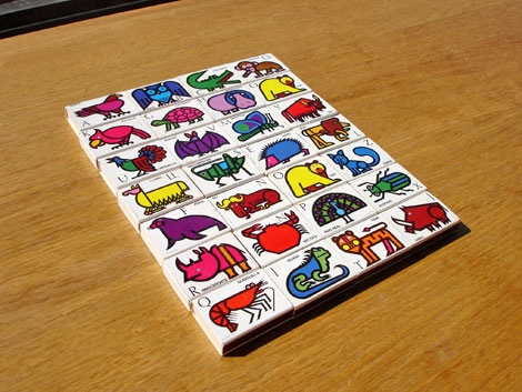
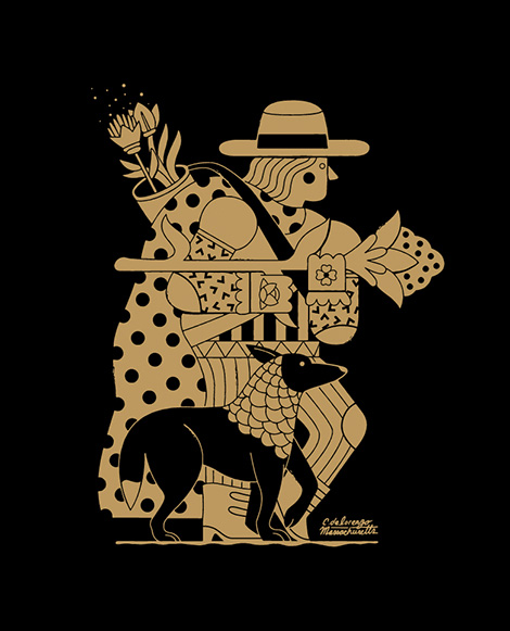
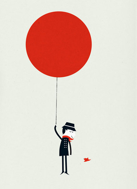
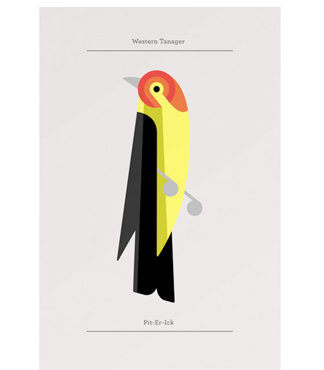
I first stumbled upon Eleanor’s work while out shoe shopping a few years ago. I found a menagerie of Keds slip-on shoes with the loveliest animal patterns ever-imaginable…doves, giraffes, camels, and even cows! It was love at first sight!

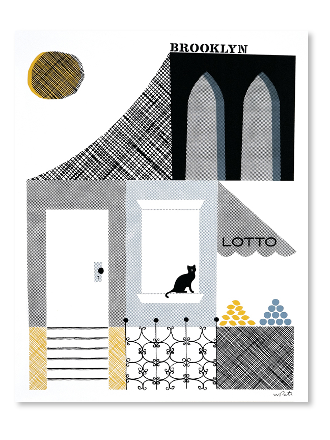
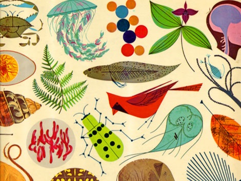
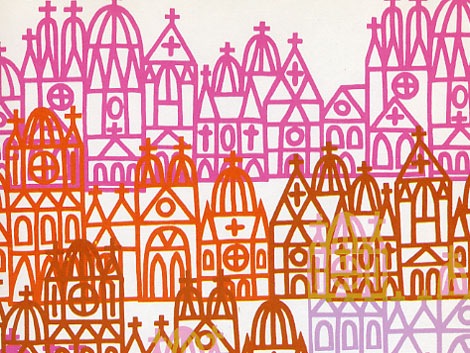
Since that shopping extravaganza, I came to learn that the wonderful Ms. Grosch was behind those whimsical designs. Her work incorporates carefully chosen color palettes with geometric shapes and attentive lines, much in the style of her hero, Charley Harper.

In addition to designing for Keds, Eleanor has also designed for Alien Workshop, Urban Outfitters, and Chronicle Books. Her work diversely appears on rock posters, skateboards, apparel, and various publications. This past April, Print Magazine honored Eleanor as one of their New Visual Artists of 2008.

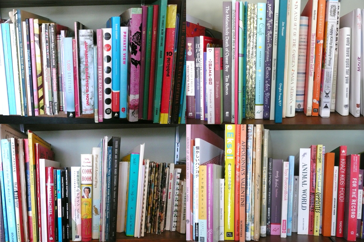
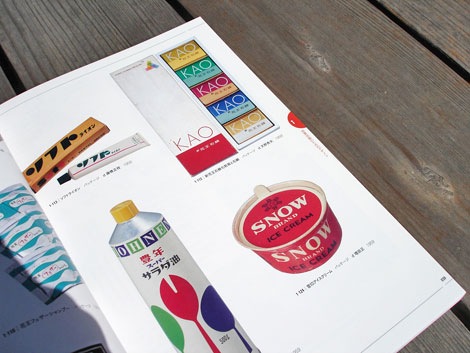
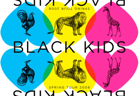
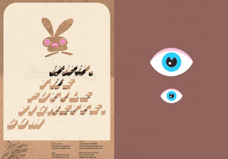
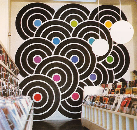
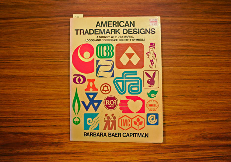
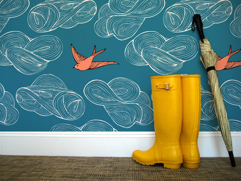
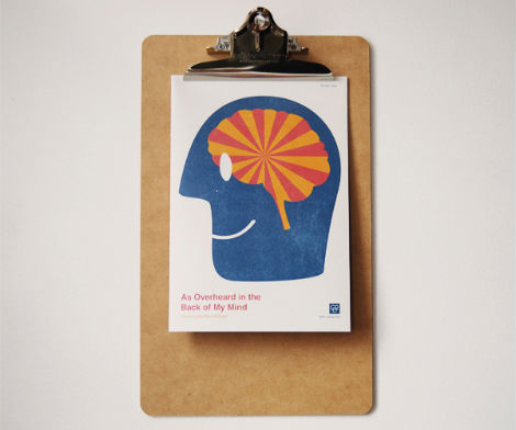
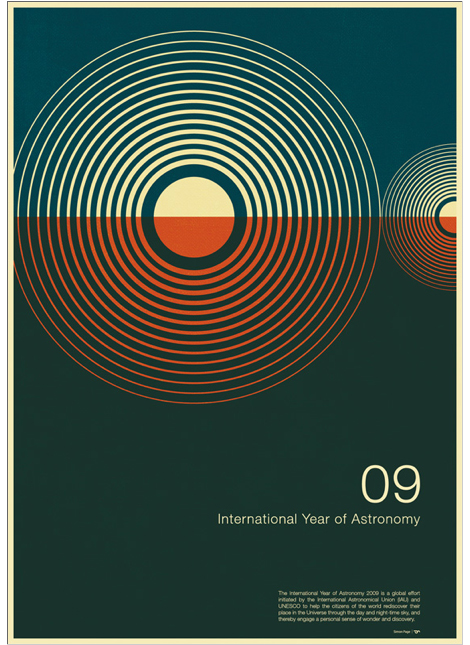
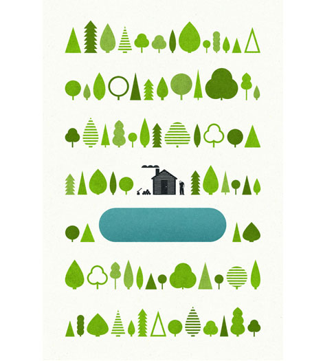
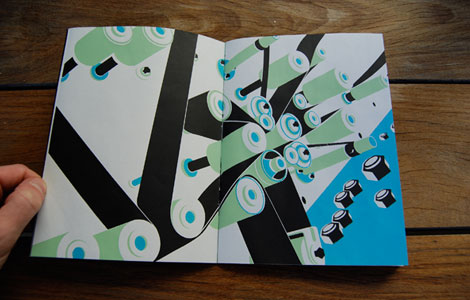
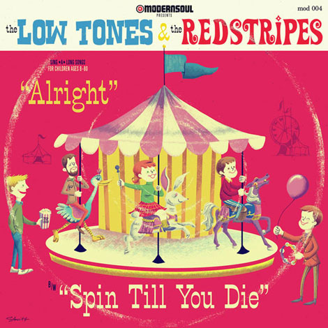
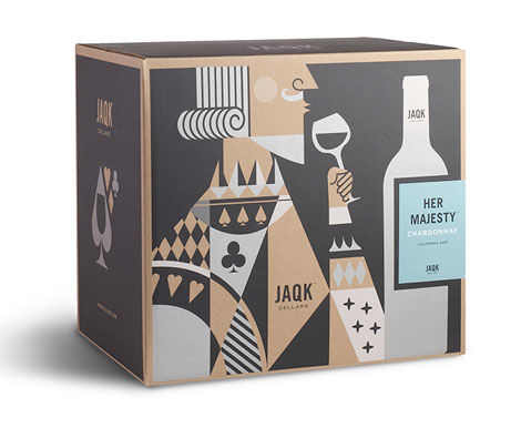
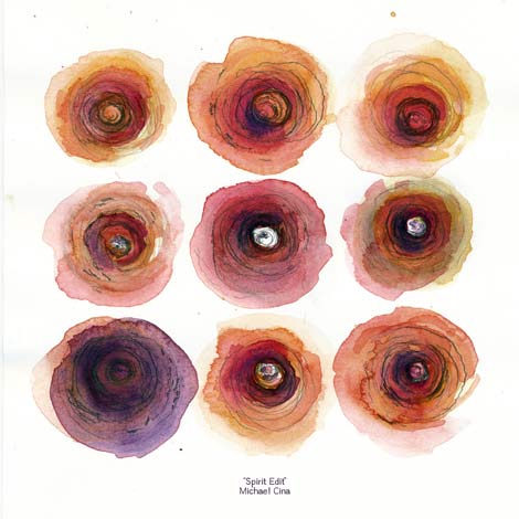
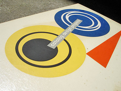
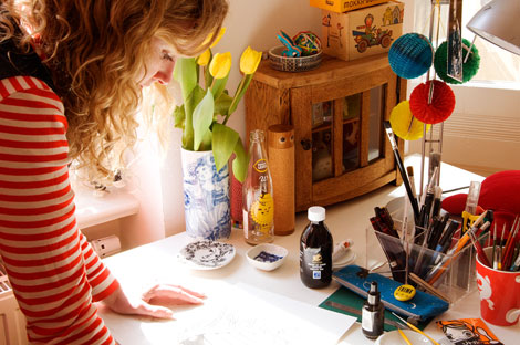
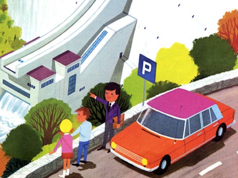
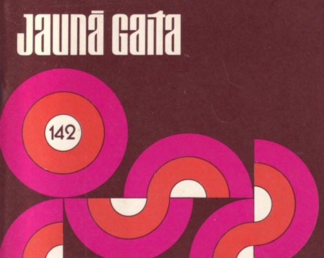
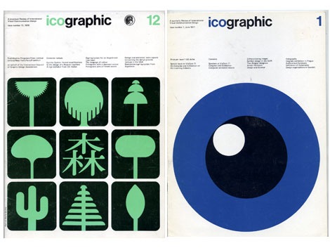
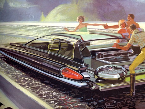
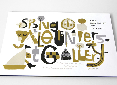
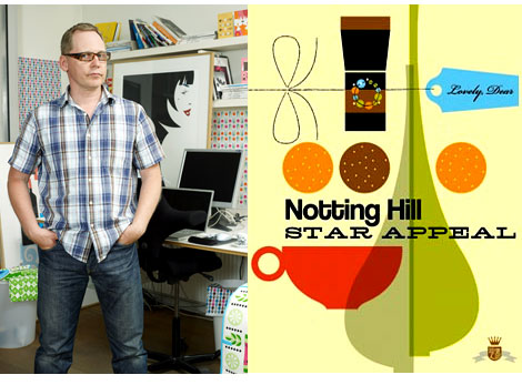
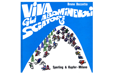
Before we bite into the meat of this interview, I’ve gathered a few nibbles and goodies of Eleanor’s work from the past years:

Read the rest of this entry »

Adrian Johnson interview

Adrian Johnson - Illustration

In the midst of Grain Edit’s one year anniversary, we’re super excited to bring you this interview with Adrian Johnson. Mr. Johnson is a UK-based designer/illustrator whose work spans editorial, print, motion, and his own self-initiated projects. He has designed for Mastercard, Giant Robot, Vodafone, and Stussy, to name a few. In the interview, Adrian talks about his background, inspirations, creative process, and of course, zeitgeist.

A lot of work nowadays is stylish, and fun, and cool, but can ultimately become irrelevant due to poorly executed ideas, or lack of decent concepts. I see Adrian’s work as a nice balance between kick-butt graphics and style, and smart ideas that get through to people.

Read the rest of this entry »

Grain Edit: The Year in Review

grain-edit-one-year

Tomorrow we will be celebrating the 1 year anniversary of Grain Edit and we’ve got a big giveaway planned, so be sure to stop by! We’ve had a great year and want to thank all our awesome readers for their wonderful comments and for making Grain Edit a frequent destination.

I’d especially like to thank all of the designers and illustrators that took time out of their busy schedules to share with us.

Some of the highlights of the past year include:

Matte Stephens showed us his awesome home.  Don Clark of Invisible Creature schooled us on his “family portrait”.  Scott Thares of Wink broke out the KISS drawings. Bo Lundberg took us behind the scenes of Barefoot in the Park and Jason Munn of the Small Stakes showed us his Horse Chest.

Ben Butcher of Pixar gave us a sneak a peek into the making of the Wall-E picture book Lots of Bots. Sean and Nicole Flores shared their insane book collection.  Ian Follett showed us some amazing stampsSmall studio, Odopod and Chronicle Books all graciously opened up their spaces for us and Mike Davis of Burlesque served us up a tight mix.

We created some new groups:

Grain Edit Facebook group

Paul Rand Flickr Group

Modern Sticker, Stamp and label club

Some of the most popular posts (besides the interviews and studio visits) of the past year include:

hans_hartmann_posters

Swiss Designer Hans Hartmann

publicity and graphic design in the chemical industry - hans neuburg

Publicity and graphic design in the chemical industry – Hans Neuburg 1967

charles-harper-book-915

Giant Golden Book of Biology – An Introduction to the Science of Life c1961

Saul_bass-henri_paris-5

Henri’s Walk to Paris- c1962- illustrations and design Saul Bass

alian_gree-kids-book-8

Alain Gree – l’electricitie c1969

israel-stamps-modern

Israeli Environment stamps designed by Eliezer Weishoff in 1975

jauna-gaita-magazine-470W

53 Years of Jauna Gaita Magazine

icographic-magazine-910

Issues of Icographic magazine 1971-1978 produced by ICOGRADA

syd-mead-illustration-6

Concepts – Promotional book for US Steel c1961

giovanni-pintori-book-5

Giovanni Pintori exhibition catalog c2003

Dutch type specimen sheet

Vette Annonce type specimen sheet late – Netherlands 1950s/ early 60s

Lastly we’d like send thank you’s to: Coudal, Design Related and Julia Rothman for allowing us to contribute to each of their sites. How magazine for naming us one of the top 10 Sites for Designers for the month of December. David Airey for including us in the Top 50 Graphic Design Blogs and for all the great sites that featured us in their posts.

We have some exciting things planned for the next few weeks and months, so stay tuned. Thanks again everyone!

If you haven’t already, consider subscribing to the Grain Edit RSS. and join us tomorrow for our 1 year anniversary giveaway!

Albe Steiner: Italian graphic designer

albe steiner graphic designer

In 1940 Albe Steiner founded the Milan based studio Graphica Foto where he and his wife Lica experimented with Photography and design. Over the course of his career, Steiner designed for Domus, Agfa, Pirelli among others.

Read the rest of this entry »

Karl Gerstner and Markus Kutter – die neue Graphik

karl gerstner die neue graphik book

Karl Gerstner and Markus Kutter – the new graphic art – c1959 published by Arthur Niggli Ltd.

Classic book that surveys modern graphic design from its origins up till the late 1950s. Filled with advertisements, posters, packages, lettering, logos and displays. Lots of Swiss design to drool over.  I just wish there were more color images.

I love the clean type and the 3 column grid on the cover. The modern day remake of the cover would be exactly the same except someone would replace the header “die neue graphik” with “this is a design book”. Ha

Includes work from: Hans Neuburg, Joseph Muller Brockmann, Richard Paul Lohse, Ladislav Sutnar and many others.

Read the rest of this entry »

Invisible Creature interview

Don  Clark disney pic

Invisible creature is the three-time Grammy-nominated Seattle based design duo of Don and Ryan Clark. Including their work while part of Asterik Studio and current work for Tooth & Nail Records, the two have created hundreds of CD packages and limited edition silk-screened posters. A small sample of their Client list includes: Foo Fighters, Chris Cornell, and Billboard magazine.

Their work is inspiring and fun to look at and they have no problem with experimentation. I’m amazed by their ability to consistently create quality work in a broad range of media.

In this interview, Don Clark shares with us some of the history of Invisible Creature and an exclusive look at the process behind “family portrait”, a piece in their recent gallery exhibition titled Haven.

Read the rest of this entry »

Modern design and the stamp – Iain Follett’s stamp collection

Iain follett stamps design collection

After discovering Iain Follett’s stamp collection was featured in Creative Review’s January 2008 issue of Monograph, I decided to contact him and see if he would be interested in sharing some of his favorite stamps on grain edit. He agreed and has graciously provided us with some choice stamps and his comments.

Continuing with our designer’s bookshelf series, grain edit is proud to present Iain Follett.

Read the rest of this entry »

Pascal Blanchet cartoons and illustration

Pascal Blanchet cartoons and illustration

I’m just in awe of Canadian comic book creator and illustrator Pascal Blanchet’s work. It was tough to decide what image to post, everything is so good.
(Many thanks to Julia at Book by its cover for passing this along)

Its the reel to reel yo

Hans Kleefeld Canadian census stamp
1871-1971 census stamp

Pretty bugged stamp from the Canadian Post.
Designed by Hans Kleefeld.

(via the great Canadian design resource)

Alvin Lustig – The Collected writings

[pictobrowser 10159078@N03 72157604156639786]

The images above are from the introduction to The collected writings of graphic designer Alvin Lustig (c1958). When I first found out about this book, I was going nuts trying to find a copy. I wasn’t able to find one, so I had to settle for a photocopy of the one presently in the RISD library. A couple of years ago, I finally tracked one down. It was worth the wait. It’s a short book (only 95 pages), but it has some real nuggets. It contains interviews and articles on Alvin from Interiors magazine, AIGA Journal, Design Quarterly, Type Talks and a few other sources. Wonderful insight into his design thinking and process.

Read the rest of this entry »

Mike Davis interview

Mike Davis - Burlesque design of North America

Mike Davis aka Mike the 2600 King is part of a design collaborative known as Burlesque of North Of America. In addition to their design work they are a full service screenprinting studio.

I first ran into Mike while on a cross country record digging trip in 2003. My friends and I were crashing with some of the cool cats at galapagos 4. They heard that Mike was spinning at one of the local clubs, so we decided to check it out. Mike was laying down some serious funk/ soul heat that night and the club was packed. Later I found out that in addition to be a great dj, he was an excellent designer creating posters for my friends at anticon.

Read the rest of this entry »

Mike the 2600 King Exclusive Dj Mix

Mike the 2600 king Exclusive grain edit Dj Mix

In the first part of our new Record Gallery Series Mike Davis (aka MIKE THE 2600 KING) – uber cool designer for Burlesque of North America has put together a gallery of some of his favorite record covers. This well rounded collection includes covers by design heavyweights like Milton Glaser to design unknowns, as in the case of the local/ private press lps.

In addition, he has created an exclusive dj mix for grain edit with songs taken from the records featured in the gallery. We hope you enjoy it.

Read the rest of this entry »

Garrett Morin illustration and graphic design

Garrett Morin-illustration-and-graphic-design
Cover illustration/typography for the Yale University Art Gallery spring catalog

Garrett Morin does great work. He draws lots of type and makes people happy. You may have seen his works in the likes of Mike Perry’s Hand Job book. If you click on over to his site, you’ll find lots of happy characters, t-shirt graphics, corn-cob pipes, animated GIFs, skateboard graphics, magazine covers, and a great animated spot for Death Cab for Cutie / MTV.

Garrett’s also a member of the Rad Mountain collective, which recently did some yummy illustrations for Good Magazine. Check it.

Wink interview

Wink Design - graphic design studio Minneapolis

My first introduction to Wink was four or five years ago when their packaging for Sunmilk was making the rounds in the design magazines and annuals. Since then, I’ve tried to keep an eye on their work. What has impressed me the most about Wink has been their ability to consistently produce top notch work.

Read the rest of this entry »

Bo Lundberg interview

Bo Lundberg - graphic designer interview

One of the notable things that has come out of producing this blog has been the opportunity to speak with designers I respect and admire. Bo Lundberg is one of those designers. Several months ago we posted some of his work. Since then Bo and I have been exchanging emails which eventually led to this interview. Here he shares a few thoughts on inspiration, as well as his creative process.

Bo’s work has been featured in Old Type/ New Type by Steven Heller, Illustration Now! published by Taschen, Illusive: Contemporary Illustration and its Context by Hellige & Klanten, as well as other publications. His clients include Wallpaper magazine, Elle, Vogue, Neiman Marcus and Scandinavian Airlines.

Without further ado, I’m proud to present Bo Lundberg.

Read the rest of this entry »

Viva la Bruno Bozzetto!

bruno_bozzetto_book_illustration.gif
Bruno Bozzetto : Viva Gli Abominevoli Sciatori
Cool cover for this obscure kids book by Mr. Bozzetto from the 1970s. Bruno is mostly know for his contributions to animated film. He has created hundreds of animated shorts and was nominated for an oscar in 1991 for a film entitled “grasshoppers”. You can read his complete biography at the official Bruno Bozzetto website.

Jason Munn interview

jason_munn-small_stakes_posters-interview.jpg

Our story with Jason Munn (The Small Stakes) begins in the summer of 2005. We had recently learned that his studio was located near our office so we decided for a little suprise visit. We arrived at his front door and rang his buzzer. When he opened the door we said something along the lines of..
Read the rest of this entry »

Page 1 of 198123...Last »