The Visual Language of Herbert Matter

visual language of herbert matter

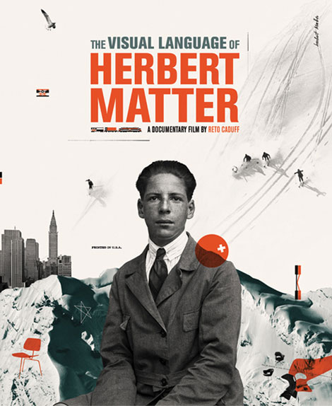
Really looking forward to the release of The Visual Language of Herbert Matter. It’s due to hit theaters this summer. The film was a finalist in the SXSW title design competition and the poster (designed by Cristiana Couceiro) just won a Merit Award at the 3 x 3 Professional Illustration Show.

(more…)

Recently Added to the Grain Edit Job Board

sebastiaan bremer

I received an email earlier this week from the nice folks at Jonathan Adler. They are currently looking for a product designer to help design soft and hard goods for new business partnerships. Other recent additions to the grain edit job board include positions at Apple and MTV Networks.

You can subscribe to our job listings via RSS, Email or follow at Twitter and Facebook.

(more…)

Karl Oskar Blase

karl oskar blase

Deutsche Bundespost: Internationales Jahr Des Kindes stamp c1979  Karl Oskar Blase’s son is the boy in the image.

Karl Oskar Blase was born in the German city of Cologne (Koln) in 1925. At the age of 25 he attended the Wuppertal School of Industrial Art to study painting and graphic design. Around the same time he formed a design studio with Felix Muller. One of the studio’s more significant projects was to develop the layout for form magazine. Karl would go on to design almost all the covers through 1968. Karl also taught at the Kassel school of Industrial Art and designed many stamps for the Deutsche Bundespost.

(more…)

Nate Williams Illustration

nate williams, n8w, illustration mundo, hola mi amiga, illustration

Buenos Aires based illustrator and artist, Nate Williams, is a force to be reckoned with! This illustration, entitled Lion and Molecules, uses an earthy palette reminiscent of A&W root beer; the chocolate brown layered over the orange and cream is a real treat! It’s choc full of organic shapes and patterns, including really lovely star bursts and variations in line texture and weights. Nate’s hand drawn type is also very fun and unique as it juxtaposes thick and thin, masculine and feminine.

(more…)

6th Biennale of Graphic Design Brno 1974

brno biennale

While I was in Maine I discovered this book put together after the 1974 Biennale of Graphic Design in Brno, Czechoslovakia (now the Czech Republic and Slovakia). The book contains notes and essays from a symposium centered around corporate identity.

Wim Crouwel contributes an essay on the problems with house-style. In the essay he discusses the role of a designer in the creation of a corporate identity program and describes the difference between what he calls “information designers” and “advertising designers. He ends the essay off with a few thoughts on trademarks (abstract symbols vs type driven solutions).

(more…)

Frank Eidlitz Posters for Shell

frank eidlitz

Awesome collection of posters for Shell Oil Company dating back to 1964. The series was created by Australian designer Frank Eidlitz.

(more…)

The Books Concert Poster by Sonnenzimmer


The Books Concert Poster by Sonnenzimmer. Measures 18″ x 24″

Our poster pick for the week was created by Sonnenzimmer. Sonnenzimmer is an art and screen print studio based in Chicago. The studio is owned and operated by artist’s Nadine Nakanishi and Nick Butcher. We’re certain you’ll find their work as appealing as we do.

The poster pictured above really puts the negative space to good use. The simple, colorful shapes balance the overall composition while the broken up landscape forms a a dynamic window to the world. You can purchase this poster here.

(more…)

Hey Studio

Hey Studio

Barcelena design studio Hey has a swath of cool projects. One of their latest, Calendar, features stylized illustrations of some of our favorite cultural and historical icons. Mr. Miyagi, Hulk Hogan, Poseidon, and Inspector Gadget are just a few. Like a good icon, these illustrations are minimal — leaving only the bare essentials to reference their counterparts.

(more…)

Infinity Owl by Aesthetic Apparatus

bulgarian stamps

This week’s poster pick was done by Aesthetic Apparatus. The owl has enjoyed a lot of attention from artists in recent years, and this owl will undoubtedly hold yours.  Note the eyes, this guy is an infinitely hypnotizing character. The greens used here are nice and bold and add an excellent touch of color. You can pick up this poster at postercabaret.com!

(more…)

Leandro Castelao

Sweet birds! I’m really digging this work from Buenos Aires designer / illustrator Leandro Castelao.

The illustrations of animals seem to have a Charley Harper-esque quality to them, but I love how they’re taken to a new “exploded-view” type level.

(more…)