50 and 50 / State Mottos Project

grain edit / 50 and 50 state mottos project

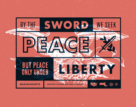
Massachusetts / Mark Weaver

50 and 50 is America’s design project. This wonderful curation brings together 50 of our nation’s most talented and patriotic designers and pairs them with their home state. With the state motto as their inspiration, these designers take those words and engrain them into a 625×492 pixel canvas, giving us a unique perspective into our great land.

(more…)

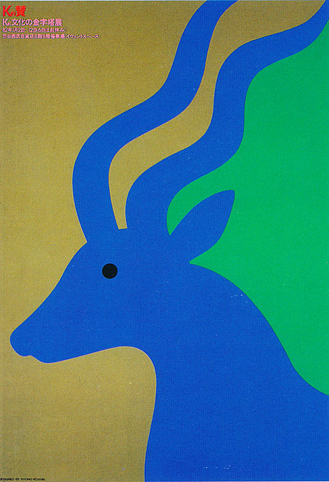
Ryohei Kojima

Ryohei Kojima

I am excited by my recent discovery of award-winning Japanese designer, Ryohei Kojima. Ryohei worked at Light Publicity Ltd,  Japan’s first creative agency, for many years before opening his own studio in 1975. Like Charles Harper, he was a master at crafting beautiful imagery by deconstructing his subjects down to their simplest forms.

(more…)

I Heart Milton Glaser

milton glaser

Here’s a special treat for Valentine’s Day. The BBC has just released a 30-minute radio documentary entitled I Heart Milton Glaser. The program includes audio snippets of Glaser as well as his contemporaries as they discuss the history and impact of the now iconic I ♥ NY design.

(more…)

Darren Booth

darren booth

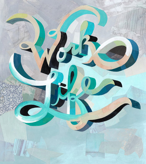
I was recently introduced to the work of Darren Booth. His artful mix of painting and typographic forms is different and in a lot of ways exciting to see. Darren has worked with an incredible list of clients, including Penguin Books, Target, AOL, The New York Times among many others, and has managed to keep a clear, consistent style throughout each project in his portfolio.

(more…)

Trademark™ / Tim Lahan

Tim Lahan, illustration, USA

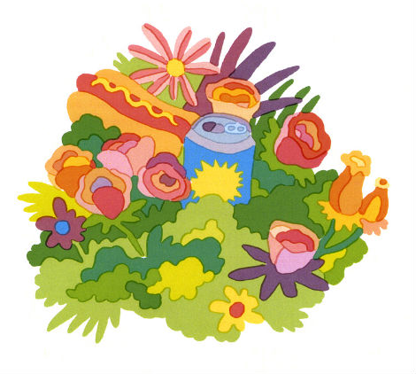
Trademark is the design studio of New York based artist Tim Lahan. With an eye for bright colors, junk food, and witty puns, Tim’s simple straightforward illustrations, letters, and logos are captivating, humorous, and sure to brighten your spirits. His work is versatile as he experiments in an array of formats including clay and moving images. Bottom line: for a fun time, count on Tim.

(more…)

New Work by Patrick Hruby

patrick hruby, illustration, usa
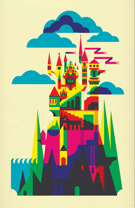
Los Angeles based illustrator Patrick Hruby has created a new series of work based on an unpublished short story titled “The Archipelago,” written by his boyfriend Seth Stewart. “The Archipelago” tells the story of a strange phenomenon called The Forgetting affecting the chain of islands that make up the archipelago. In order to prevent The Forgetting, each island tells a tale to preserve its artifacts, history, and memory. Patrick illustrates this story beautifully with his signature use of punchy colors and geometric forms, creating his interpretations of islands, its wayward inhabitants, and their belongings.

(more…)

Simon Walker

grain edit / simon walker

The above (and below) typographic wizardry is brought to you by Simon Walker. I’m a total sucker for typographic compositions of this nature, and Simon has them in spades. Viewing his typographic and compositional skills paired with his bold, grungy take on Americana is an absolute delight.

(more…)

Sue Doeksen

Sue Doeksen

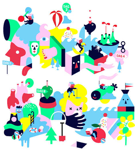
Hailing from the Netherlands, illustrator Sue Doeksen creates wonderful worlds that are overpopulated with bright colors and friendly shapes, with mediums ranging from physical, digital, pencil-drawn, paper-cut, and animated. Judging from the massive amounts of blissfully exciting work on her blog, Sue is clearly one of those artists that doesn’t give up: most likely because she can’t stop creating.

(more…)

Rhodesia was Super Serigraph

derek yaniger

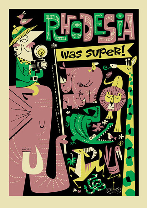
Korero books recently collaborated with Derek Yaniger again and the result is a new Serigraph entitled “Rhodesia was Super“. This four color silk-screened print is based off a travel slogan from the 1970s and is limited to an edition of 100. All profits will be donated to the Zimbabwe Agricultural Welfare Trust, a charity which seeks to provide support for the beleaguered agricultural community in Zimbabwe.

(more…)

Yehteh

yehteh

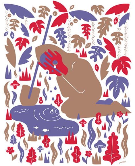
Zurich, Switzerland based Philipp Dornbierer, a.k.a. Yehteh, is a digital illustrator and designer. Philipp has a great way of basing his work around rather doomy symbolism, such as swords and hooded executioners, but juxtaposes them with bright colors, pleasing patterns, and some friendlier icons to create joyfully accessible imagery. Some of my favorites include his collaborations with stateside’s Andy J. Miller. With a client list including Carhartt, IBM, and 55DSL, I think we can expect to see a lot more great things from this guy in the near future.

(more…)