Siggi Eggertsson

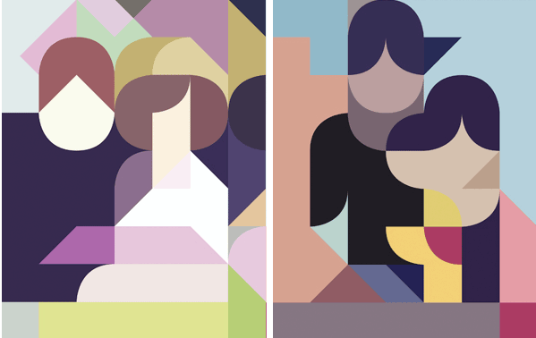
Talk about a new spin on the old family portrait!

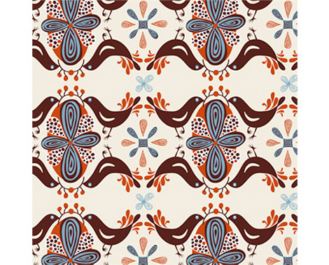
Icelandic illustrator/designer, Siggi Eggertsson, successfully combines unusual geometric shapes and muted colors to create refined abstractions. He has an impressive collection of work, ranging from posters and type to mosaics made from his collection of 20,000 basketball cards from the 90s. See more on his website, www.vanillusaft.com.

Images via Product of God.

Rica Takada

rica takada japan

One person we adore at Grain Edit is Japanese illustrator Rica Takada. Beauty and whimsy meet simplicity in each of her works. She uses natural vibrant colors and textured shapes to create depth, and also meticulously plays with clean and often rhythmic lines. Some of her work includes designing decorative pieces for the home, illustrating CD covers featuring wide eyed dreamy mod gals, and publishing books including Un Coin de Soleil and Moi Saison Préférée. Find out more by visiting her site, www.weekendstroll.com.

(more…)

Helen Dardik

Helen Dardik

Helen Dardik‘s bird patterns make me happy. All of her work makes me happy, in fact. Helen is an Ottawa (by way of Israel, Siberia, and Ukraine) based illustrator/designer/painter/toy maker. Her work is a nice combination of type, color, texture, and pattern. I love her loose, whimsical style.

Helen is represented by Lilla Rogers, and has an orange blog!

The Post Family

The Post Family

Late start today. We’ve been as busy as a bunch of mid-century bees over here. Gettin’ that bees milk.

The Post Family is a design and cool people collective based collectively in Chicago, the largest city in Illinois. Their collection of prints for sale is really wonderful — I want every one of them. Love that flat, bold, sketchy illustration style. Each of the seven Family members contributes to their blog, and they’ve just started a monthly Studio Tour feature that looks like fun.

But in my opinon, the best feature of the site are the family member bios. I read and chuckled at each one.

The above image with the yummy type was snagged from their Flickr page.

Gavin Potenza / The Stamps of the World

Gavin Potenza

Gavin Potenza, aka the Portland Stamp Champ, has some recent and awesome stamp activity going on. Awhile back we posted on his Homage to the Stamp, and now he has something new entitled A Field Guide To: The Stamps of the World. Commissioned by Tiny Showcase, this print takes inspiration from the cultures of various countries (including old favorites such as Brazil, Canada, France, and Mexico), and assembles them in a lovely 21″ x 29″ print.

In addition to this, Gavin’s Homage to the Stamp was available as a letterpress print. (But is now sold-out, sadly.)

See more info, or purchase Stamps of the World for yourself or for your loved ones or for me.

Klas Fahlen: Illustration and Design

klas Fahlen illustration

Swedish illustrator, Klas Fahlen, has such an eye for detail and beautiful energetic line work. Some of his illustrations remind me of the work of Olle Eksell and Stig Lindberg. Check out Klas’ portfolio here via Art Department.

Andrew Townsend

Andrew Townsend

Really love this pattern-filled type by Andrew Townsend, done for Nottingham Trent University’s Art and Design book. Andrew is the art director over at Un.titled, and the purveyor of many fine typographic and design projects on his own site.

His Sports Brand type experiments are well worth checking out, as is Previous/Next.

Everything is OK

Everything is OK

San Francisco design champ Christopher Simmons wants you to get involved. Christopher is a former AIGA SF president and the owner/operator of Mine, an SF design studio. Everything is OK is a social experiment, equal parts activism, commentary, and a call to action to fight complacency. So get off your butt already!

EIOK is a nominee at the People’s Design Awards! Vote, vote, vote.

(more…)

And we have a winner…

book_designers-1.jpg
Congratulations to Anne from Oakland! She is the lucky winner of our Book Design of Graphic Designers in Japan book giveaway. Last night we randomly pulled her name from a bright orange trash can. Thanks to everyone for entering our drawing.

Be on the look out for our next giveaway.

Baby spells “bee” with Harry Bertoia and Eames

1950s-alphabet.jpg
Joel at Blue Ant Studio has designed a wonderful alphabet for kids using iconic mid century modern furniture. The design was originally limited to wooden building blocks, but now theres plans for a poster as well. Why didn’t I have something like this when I was a kid? Learning the alphabet would of been a piece of cake. I can see all the spelling bee trophies I would of won thanks to Eva Zeisel and Hans Wegner.