The Jazz Loft Project

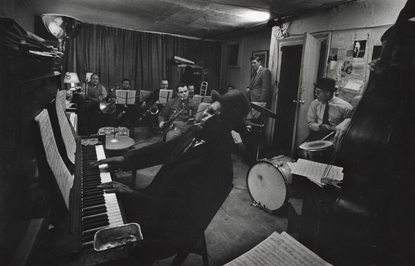
From 1957-1965 W. Eugene Smith, a prolific American photographer, documented New York jazz musicians in his small loft and ended up with 4,000 hours of audio and 40,000 photographs. His dilapidated loft in the wholesale flower district was the place for late-night jam sessions for Miles Davis, Charles Mingus, Charlie Parker, Thelonious Monk, Steve Reich, Zoot Sims, Roland Kirk, and Alice Coltrane. He also recorded drug addicts, neighborhood cops, radio programs about aliens, MLK and JFK on the radio, James Baldwin and Frank Lloyd Wright in interviews. When Smith died, he accumulated 1,740 reels of tape. Below are some of his photos and tape boxes from his collection.

(more…)

Mihail Mihaylov

Mihail Mihaylov

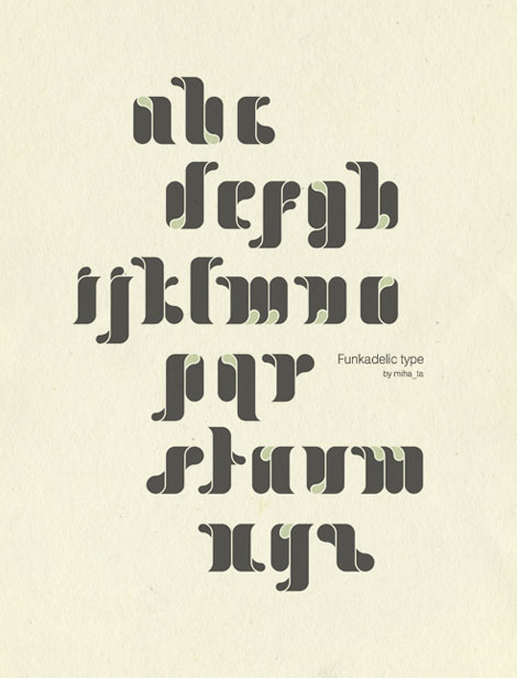
Funkadelic! There is some serious soul in this typeface from Bulgaria-based designer Mihail Mihaylov. I’m such a sucker for bold type — I love the juicy, drippy, saturated feel of these letters. I can’t quite tell if the type is sprouting, or three-dimensional, or both.

In addition to Funkadelic, Mihail’s other work shows a nice combination of experimentation and style. I love the textural, hands-on feel of the Quotes alphabet studies, and the subsequent large-scale “E” poster. Really fun work.

(more…)

Mikey Burton

Mikey Burton

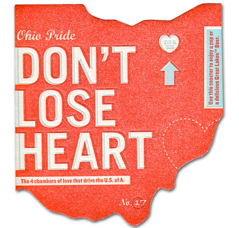
It’s great when you find that one designer that can wear various design hats. Such is the case with Philadelphia’s Mikey Burton. Looking through his portfolio, I’m impressed with the amount, style and conceptual range of his work. The edgy boldness of the letterpress prints is a nice balance to some of the quieter, more restrained logos.

(more…)

Eric Smith / I Draw All Day

I love the portfolio from Washington-based Eric Smith. Mr. Smith’s work seems to represent his friendly, optimistic personality quite well. Based on his monikor (I Draw All Day) and portfolio, one can assume that Eric does, indeed, draw all day.

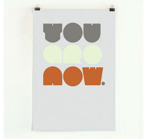
Style wise, the overall simplicity, boldness, and use of color is very compelling. I’m particularly drawn to Eric’s hand-drawn typographic work and style. I love the way in which the letters are formed and put together.

(more…)

Alphabet! Keychain Collection by Mike Davis

Mike Davis, Burlesque Design

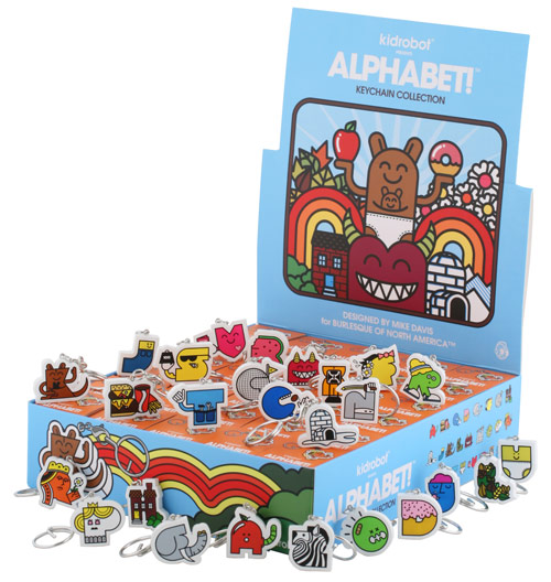
What a way to hold your keys! These Alphabet! keychains by Mike Davis of Burlesque Design are not only fun, but functional too! Originally created as a poster design and gift for his niece, these little letters are now a series of vinyl zipper pull keychains for Kidrobot. Each tiny colorful package contains a surprise letter. Mmm…the letters “B” and “D” look so delicious!

(more…)

Chad Hagen: Nonsense Info Graphics

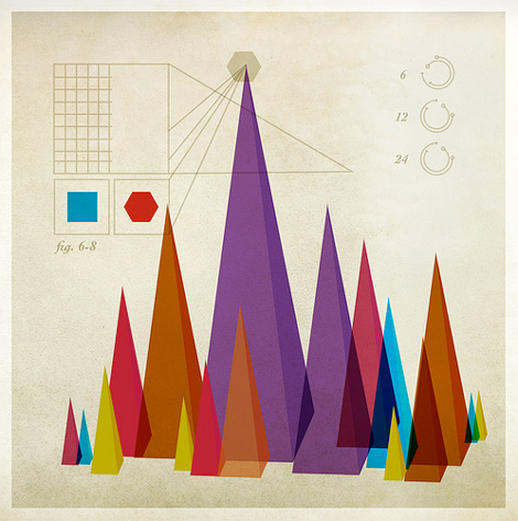
What is this graph measuring? Stalagmite height? Point source density? Christmas tree farm growth? We don’t know, but they sure do look good. Chad Hagen has made a great collection of “Nonsense Info Graphics” and put them in a set on his Flickr.

(more…)

Paul Sych / Faith

neutraface blocks

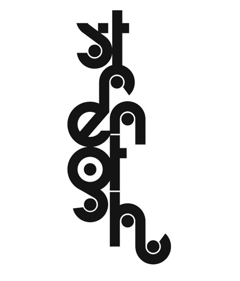
I’m really impressed with these typographic treatments from Paul Sych. Each one of them is totally sublime and refreshingly unique — they break out nicely from the common type trends going around. On one hand the work is very playful and expressive, but on the other hand also demonstrates a sophisticated knowledge and expertise of the letterforms.

(more…)

Paul Hollingworth / Slinkytype

Paul Hollingworth / Slinkytype

I remember getting Slinkys around the holidays and thinking “Awesome! I can’t wait to work the stairs with this!” Then, within an hour (without fail) the poor Slinky would be stepped on, kinked, and forever ruined. And the cycle would repeat a year later.

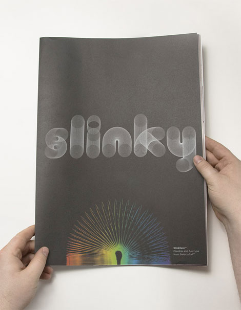
This sans-kink typeface, Slinkytype, from Paul Hollingworth brings me back to those exciting stairs-filled days. I love how the playfulness mixes with precise geometric details — the perfect combination of typography and nostalgia. And that white type on black is super snappy.

(more…)

Borja Bonaque

Borja Bonaque city scape

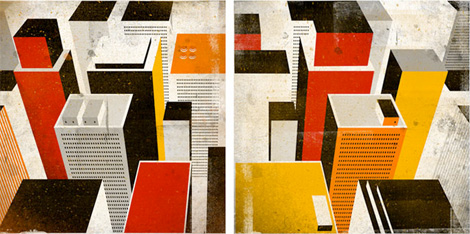
Love, love love! this work from Spain-based Borja Bonaque. I’m a huge fan of city-scape illustration (à la Evan Hecox and Andrew Holder) — so I was pretty enamored with Borja’s work to say the least. The texture, composition, and (superb!) color choice all work together to give these illustrations that heavy punch. That city above reminds me a little of Sin City, and those other comic book-to film adaptations.
(more…)

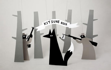
Jean Jullien

Jean Jullien

This illustration spent some quality time as the desktop background on my laptop, and was the subject of many rave comments. London based illustrator/designer Jean Jullien did the illustration for Kitsune Noir‘s very cool desktop wallpaper project. I really love these dimensional illustrations, very bright, playful and quirky.