


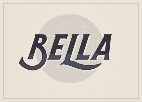
Highway by Dan Cassaro
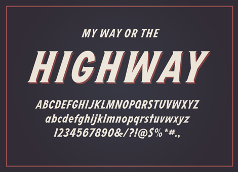
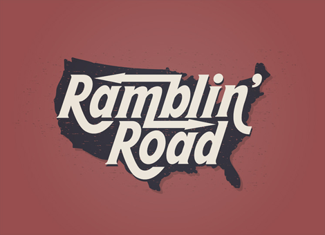
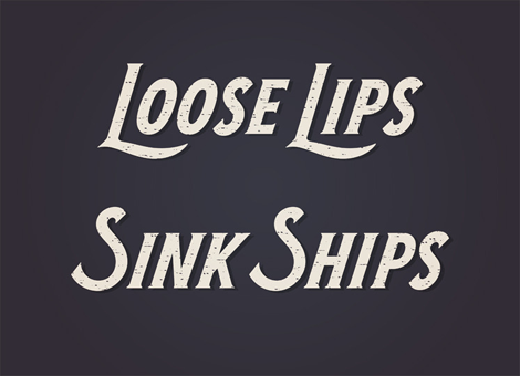
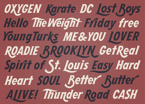
As users of an ever-changing internet, it’s amazing to see large project come together by someone that we’ve been following for years. In this case, I was lucky enough to get a sneak preview of a really great new typeface by Dan Cassaro, called Highway. Easily manipulated to create the look of lettering, but tight enough to use as ready-to-go typography, Highway fills the gap of versatility that many will find just perfect for their next project.
To get a bit more insight into the process and how the idea began to come together, I asked Dan a couple of questions.
I know that you took a fairly epic road trip around the country during the summer last year. How did you translate that into returning home to work on such a labor-intensive project?
I was really ready to get back to work full time when I got back to Brooklyn. Traveling every day is harder work than I thought it would be but most of the initial work on the typeface was actually done on the road. When I finally got home, it was actually really nice to zone out on a computer screen for hours on end. The back of a camper in a RV park in Arizona is a charming, but probably a less than ideal place to get work done. I’m not complaining though, I’ll probably do it again this summer.
Your work speaks to an era of rustic, hand-made lettering and typographic styles. How did you let that influence your type designing process?
I have always been charmed by imperfect typography and lettering that is just a little bit off. We aren’t robots and design isn’t an assembly line and I find it much harder to relate to letters that look like a they came out of a machine.
There was a time before digital reproduction and desktop publishing when most advertising and signage had to be done by hand. Not just sign painters making show cards, but unskilled Joes just trying to draw a knock-off Futura in there shop window. That stuff is painted all over the guts of America and I got to see all of it this summer. I don’t mean to be hokey but that stuff feels alive to me and inspires me more than any single designer ever has.
You know what kills me about all of this “unskilled” lettering? It’s always PERFECTLY SPACED. I went to school for 4 years to learn how to kern a headline and Farmer Brown crushes it on his first try.
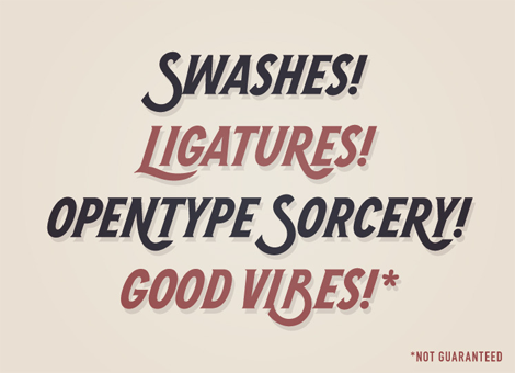
How did you find the process of creating a full typeface with swashes and ligatures? (as in, was it tedious, fun, annoying, the most amazing thing ever, etc?)
It was definitely a new thing for me, both the technical aspects and the whole “patience” thing. I am, by nature, a very fast worker and that isn’t the best approach for making a system of letters. I thought it was going to feel like math class or something, but I ended up enjoying it; teaching my left and right brain to get along. I didn’t make myself crazy over it for fear that I would suck all the personality out of the letters; nobody is going to be setting the Bible in this typeface. I was also lucky to have some help from James Edmondson with FontLab which made the whole process a lot easier.

Thanks to Dan for the sneak peek. If you’d like to get a copy of Highway for yourself, head on over to his website.
——————–
Also worth viewing:
Alicia typeface by Alexander Wright
Telegramme Studio
Jaime Van Wart
Not signed up for the Grain Edit RSS Feed yet? Give it a try. Its free and yummy.
——————–
TagsDan Cassaro, graphic-design, Typography, USA
